Bathroom Wall Art Prints for Small Bathrooms, Ensuites, & Half Bathrooms
By Anne N.May 23, 2026 | 10:00 AM AEST (Featured image: Icy Leaves framed botanical bathroom wall art print beside a white vanity, brushed…
By Marcus C.
January 28, 2026 | 1:00 PM AEST
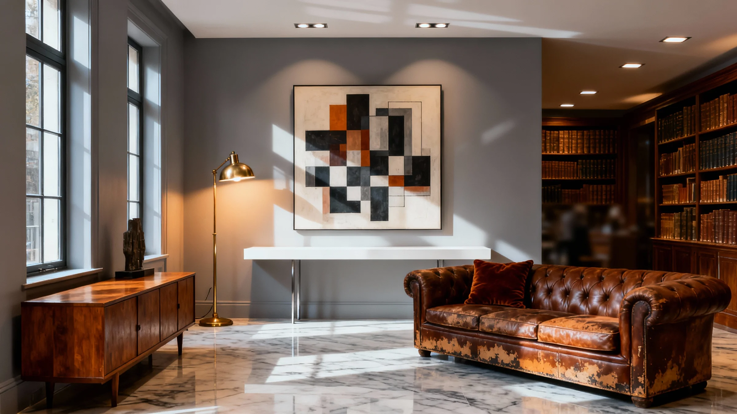
(Featured image: Framed geometric abstract artwork displayed in a refined living space with a leather sofa and floor lamp. Photo by VanVakarnee.)
There is a distinct, quiet confidence found in a home that refuses to pick a single timeline. The most compelling interiors are rarely those that strictly adhere to a catalogue aesthetic, whether that be the stark minimalism of the mid-2000s or the heavy ornamentation of the Victorian era. Instead, the magic lies in the dialogue between eras—the tension and harmony created when you place modern wall art prints against a backdrop of history.
This approach to interior design—often termed “transitional” or eclectic—requires a delicate hand. It is not merely about placing new items next to old ones; it is about curation. When done correctly, contemporary art breathes fresh energy into antique furniture, preventing a space from feeling like a museum. Conversely, vintage pieces lend weight, patina, and soul to modern imagery, grounding the aesthetic and preventing it from feeling stark or impersonal.
Whether you have inherited a heavy mahogany sideboard, collected mid-century teak, or live in a property with period architectural features, the introduction of contemporary art is the most effective way to bridge the gap between the past and the present.
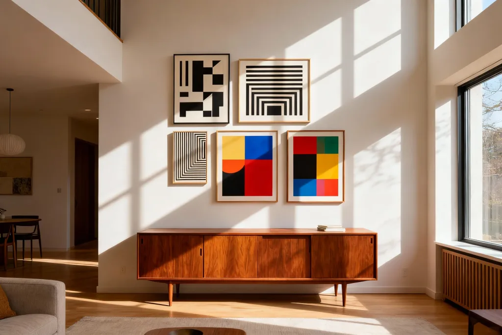
(Featured image: Six framed abstract and geometric artworks arranged as a gallery wall above a wooden sideboard in a light-filled interior. Photo by VanVakarnee.)
At its core, interior styling is about balance. If a room is filled entirely with antiques, it can feel heavy, dark, and somewhat stifling. It lacks the urgency and crispness of the current moment. However, a room furnished entirely with modern pieces can sometimes feel sterile, lacking the narrative depth that comes with age.
Introducing modern wall art prints to a vintage-inspired room creates a visual juxtaposition. The clean lines, bold typography, or abstract forms of contemporary work cut through the visual “noise” of turned wood legs, velvet upholstery, and intricate carving.
This contrast highlights the best attributes of both elements. The sharpness of a geometric print makes the worn grain of an oak table look richer and more tactile. The age of the furniture makes the bright, unblemished surface of the art look more vibrant. It is a reciprocal relationship where each element validates the other.
Not all modern wall art sits comfortably with every style of vintage furniture. While rules are made to be broken, understanding the visual language of your furniture is the first step toward a cohesive look.
Mid-century furniture is defined by organic curves, tapered legs, and warm woods like teak and rosewood. Because this era was arguably the birth of modernism, it pairs exceptionally well with:
Furniture from these periods tends to be darker, heavier, and more ornate. To prevent the room from feeling gloomy, you need art that brings light and air.
For spaces utilizing reclaimed wood, metal, and leather, the goal is to add refinement.
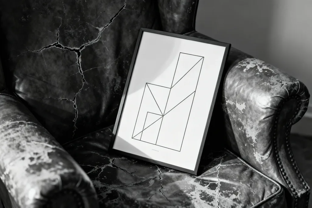
(Featured image: Framed minimalist line artwork resting on a distressed leather armchair. Photo by VanVakarnee.)
When browsing an online wall art store, it is easy to focus solely on the image itself. However, in a home filled with vintage character, the materiality of the print and its framing becomes paramount.
Vintage interiors are texturally rich. You are dealing with velvet, linen, wool, brass, iron, and wood grain. High quality wall prints must hold their own against these dominant textures.
Cheap, glossy paper will stand out aggressively against the matte, time-worn surfaces of antiques. It reflects light in a plastic, artificial way that breaks the immersion. Opt for giclée prints on heavy, matte, or fine art paper. The lack of sheen allows the ink to absorb into the paper, creating a depth of colour that feels substantial and permanent—qualities that mirror the furniture itself.
The frame is the bridge between the art and the room.
Colour is the thread that stitches the eras together. When the style of the art and the furniture opposes one another, the colour palette must agree.
This does not mean perfect matching. If you have a rust-coloured velvet sofa, you do not need modern wall art prints dominated by rust. Instead, look for complementary tones or subtle echoes. Perhaps the artwork features a small stroke of burnt orange, or a cool teal that sits opposite rust on the colour wheel.
If your vintage room is visually “busy”—perhaps with Persian rugs and patterned curtains—lean towards abstract wall prints with ample negative space (white space). This gives the eye a place to rest.
Conversely, if your vintage pieces are solid and neutral (brown wood, beige linen), you have permission to go bold. Vibrant, saturated contemporary prints can act as the focal point, energizing the brown tones of the wood.
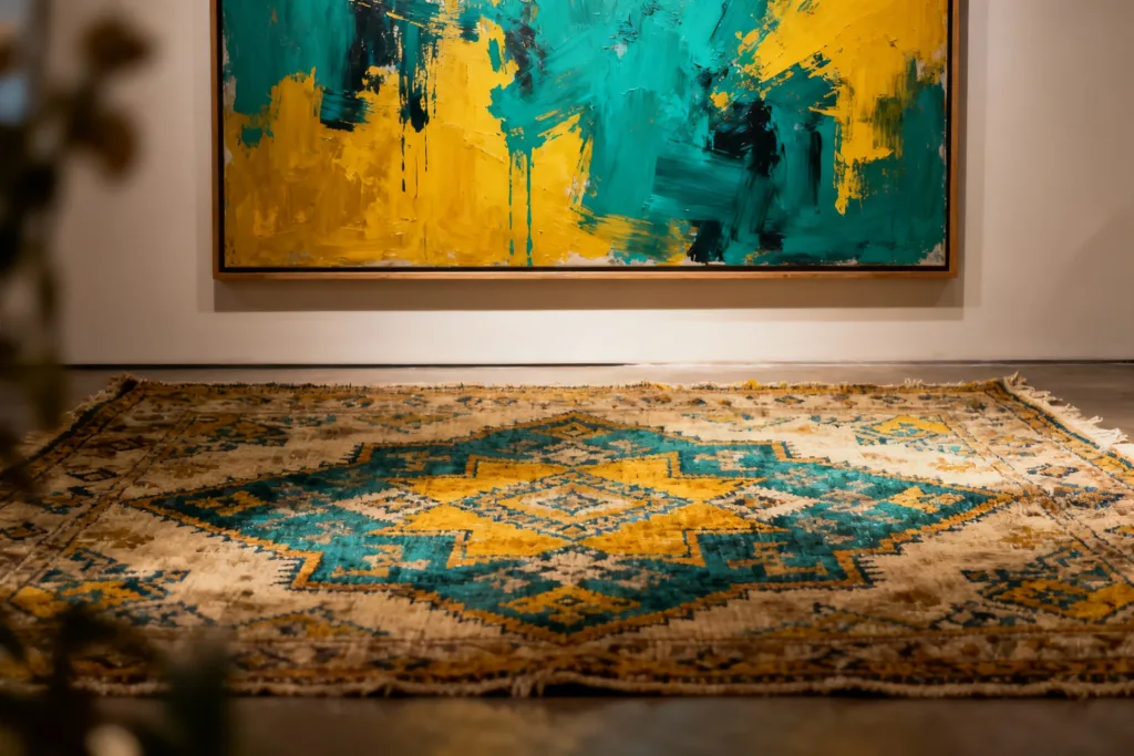
(Featured image: Large framed abstract artwork in teal and yellow displayed above a patterned rug. Photo by VanVakarnee.)
One common mistake in period homes, particularly those with high ceilings, is undersizing the artwork. A small A4 print floating in the centre of a large Victorian wall will look lost and apologetic.
Luxury wall art prints often come in large formats, and you should utilize them. A single, oversized piece of modern art commanded above a fireplace or sofa feels intentional and confident. It respects the scale of the architecture.
Gallery wall ideas for vintage interiors often fall into two camps: the grid and the salon hang.
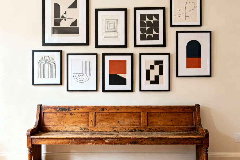
(Featured image: Gallery wall of framed abstract and geometric prints arranged above a vintage wooden bench. Photo by VanVakarnee.)
This is usually where the most significant vintage pieces live—the sofa, the sideboard, the coffee table.
Vintage bedrooms often feature heavy wardrobes or iron bedframes. The atmosphere here should be restorative.
Hallways in older homes can be narrow and dark.
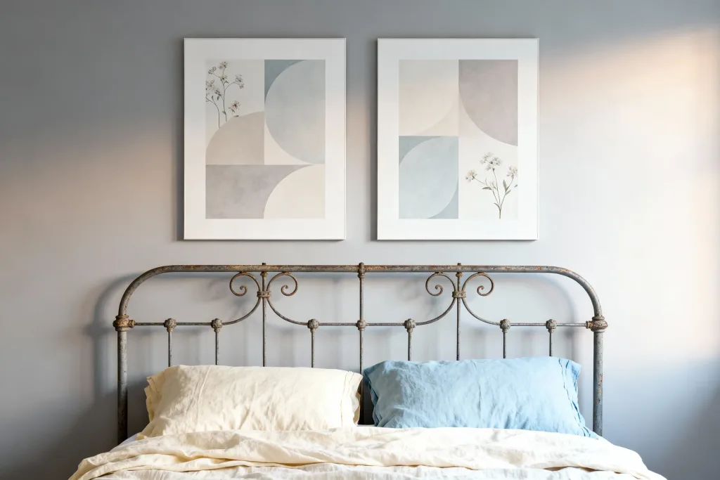
(Featured image: Pair of framed abstract prints with soft geometric shapes displayed above a metal bed frame. Photo by VanVakarnee.)
The success of mixing old and new relies heavily on the quality of the “new.” When the vintage elements of a home have stood the test of time for fifty or a hundred years, the modern additions must exude a similar level of integrity.
At Vanvakarnee, the collection is curated with this specific balance in mind. The focus is on luxury wall art prints that possess the depth and tonal accuracy required to sit alongside heritage interiors. Whether it is the weight of the paper or the archival quality of the ink, the objective is to provide art that feels permanent.
Finding modern wall art that does not feel disposable is the key to this aesthetic. A Vanvakarnee print is designed to be a future heirloom in its own right—a piece of the present day that you will be proud to pass down alongside the furniture.
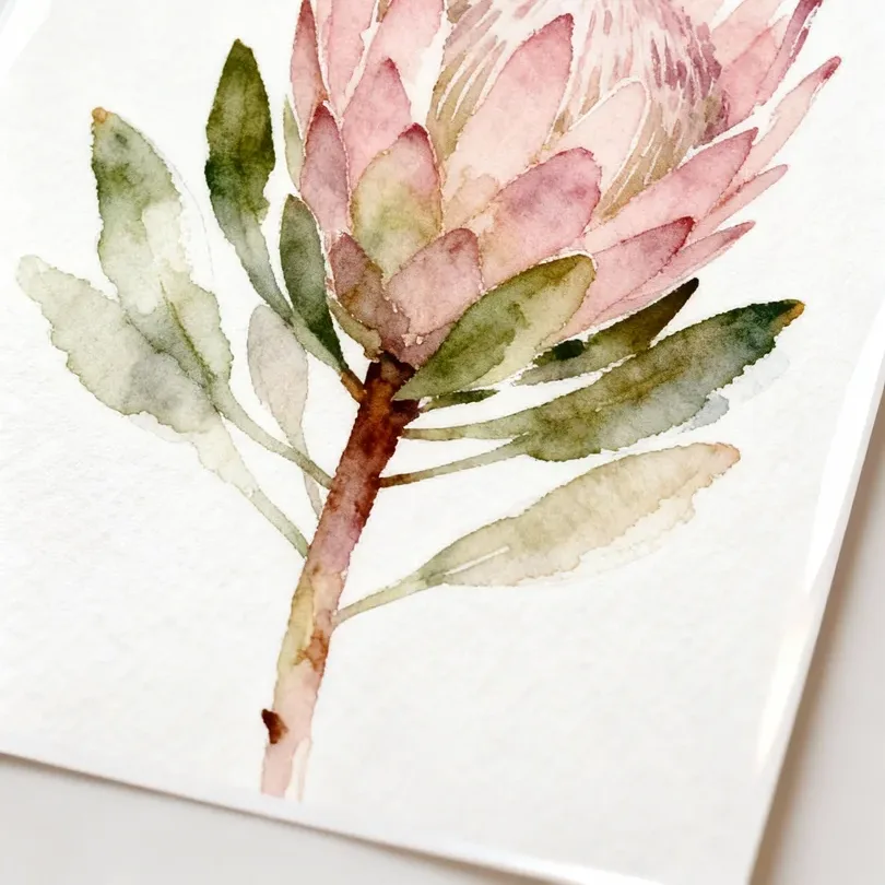
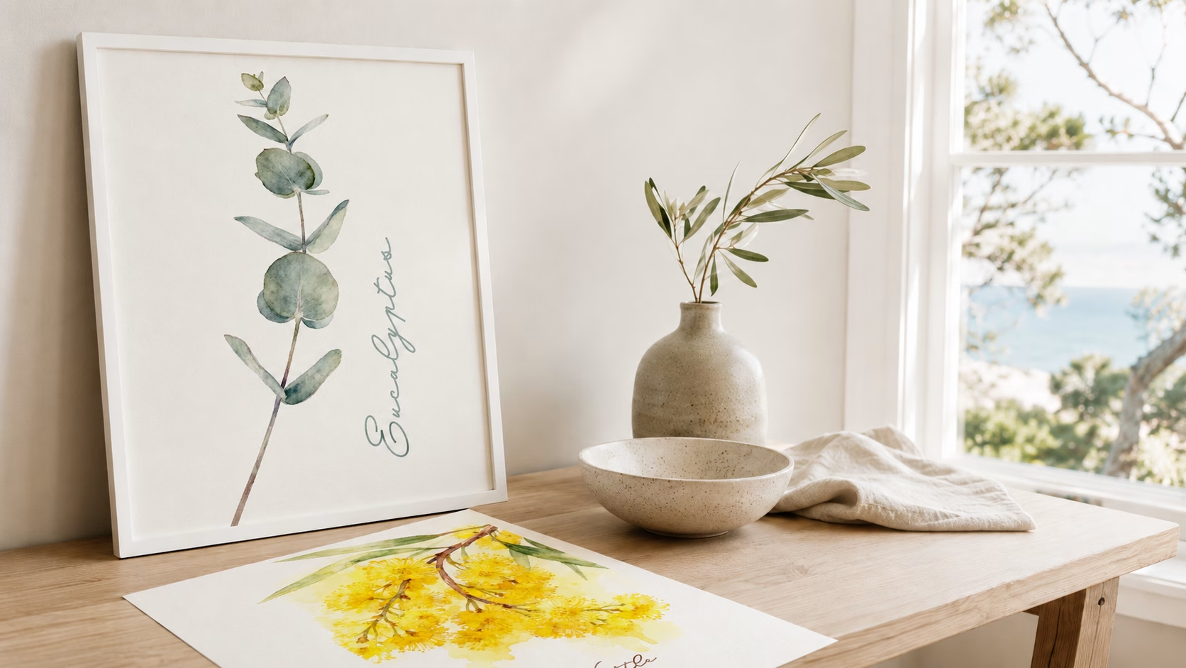
(Featured image: Watercolour botanical artwork depicting a flowering stem on gloss paper. Photo by VanVakarnee.)
Styling a home is an act of storytelling. By combining the sleek, forward-looking nature of modern wall art prints with the soulful, grounded presence of vintage furniture, you create a space that exists outside of fleeting trends.
It is a look that acknowledges the past while firmly living in the present. It allows you to rescue that beautiful, battered armchair from the antique shop, knowing exactly how to make it feel fresh: by hanging a piece of bold, uncompromising modern art right above it. Trust your eye, respect the balance of texture and colour, and enjoy the unique energy that comes from the meeting of two different worlds.