Bathroom Wall Art Prints for Small Bathrooms, Ensuites, & Half Bathrooms
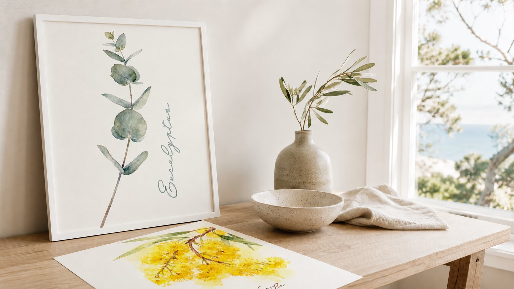
By Anne N.May 23, 2026 | 10:00 AM AEST (Featured image: Icy Leaves framed botanical bathroom wall art print beside a white vanity, brushed…
By Angus W.
December 2, 2025 | 4:08 PM AEST
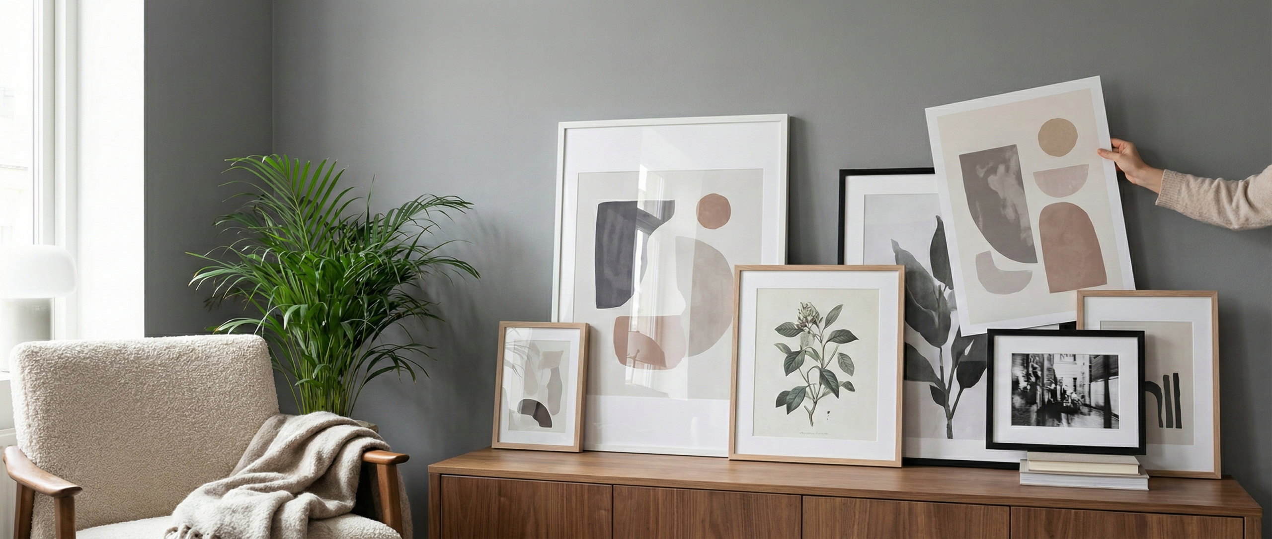
(Featured image: A curated mix of abstract and botanical prints being styled against a grey wall. Photo by VanVakarnee)
Gray. It has been the reigning king of interior paint colors for the last decade. It is elegant, modern, and provides a clean slate for decoration. But recently, many homeowners have found themselves standing in their living rooms wondering: “Why does my home feel like a rainy day?”
If your space feels a little too cool, clinical, or uninviting, you are not alone. The “gray trap” is a common design dilemma.
The instinct is often to repaint, but that is a messy, expensive hassle. The secret that interior designers know is that gray is just the canvas; it isn’t the painting. You don’t need to change your walls to change the temperature of the room—you just need the right wall art.
At VanVakarnee, we believe art is the soul of the home. Here is how to select the perfect pieces to turn a cold, gray room into a warm, inviting sanctuary.
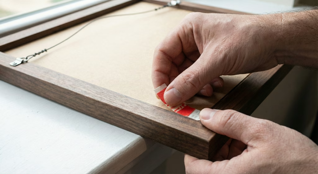
(Featured image: A hand applying a non destructive adhesive to the back of a photo frame. Photo by VanVakarnee)
Before we pick out prints, we need to understand a little bit of science. Why does your gray room feel cold?
Most gray paints on the market are “cool grays,” meaning they have blue or violet undertones. Even if the paint looked neutral in the can, once it is on the wall, it reflects light in a way that mimics a cloudy sky or a shadow.
The basic rule of color theory is complementary contrast. If you look at the wheel, the direct opposite of Blue/Gray is Orange/Gold. When you place these colors next to each other, they vibrate. The warmth of the orange neutralizes the chill of the blue, creating a visual balance that the human eye finds incredibly satisfying.
You don’t need to paint your ceiling orange; you just need to introduce these tones through your focal points: your wall art.
If you are browsing the VanVakarnee collections and wondering what will pop against your walls, these are the four fail-safe palettes designers use.
1. The Earth Tones (Terracotta, Rust, Burnt Orange)
This is the number one way to make a gray room feel “homey.” Earth tones act as a grounding force.
If earth tones are too rustic for you, look toward the sun. Mustard yellow and gold accents act like artificial sunshine in a gray room.
Nature never clashes. If you are afraid of bold colors, green is your best friend.
4. High Contrast (Black & White)
Okay, this doesn’t technically “warm up” the room, but it saves it from looking “muddy.”
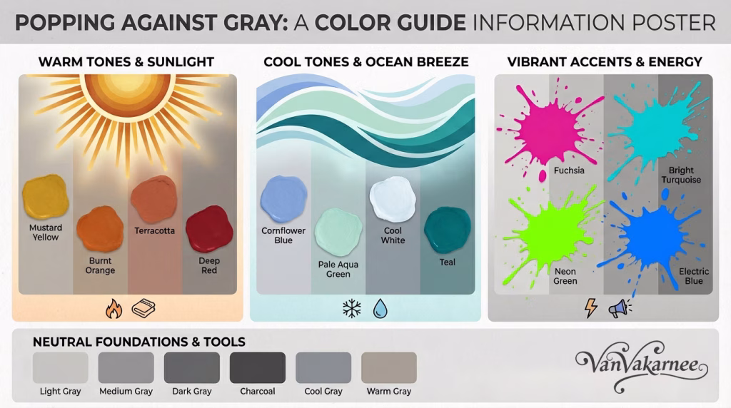
(Featured image: A color guide for the best colors to pop against gray. Photo by VanVakarnee)
When shopping for art, the image is only 80% of the decision. The frame is the furniture for your wall, and it plays a massive role in warming up a gray room.
This is the secret weapon for grey walls. Paint is flat; wood has grain and texture. By using a natural oak or walnut frame, you introduce organic warmth immediately. The honey tones in an oak frame fight the “flatness” of the gray paint, creating a border that separates your art from the wall and makes it pop.
If your style is more “Glam” than “Scandi,” go for metal. A thin gold frame catches the light and adds a layer of luxury that creates a warm sparkle.
Avoid silver, chrome, or gray frames. Placing a gray frame on a grey wall usually makes the art disappear into the background (camouflaging it), contributing to that “rainy day” feeling we are trying to fix.
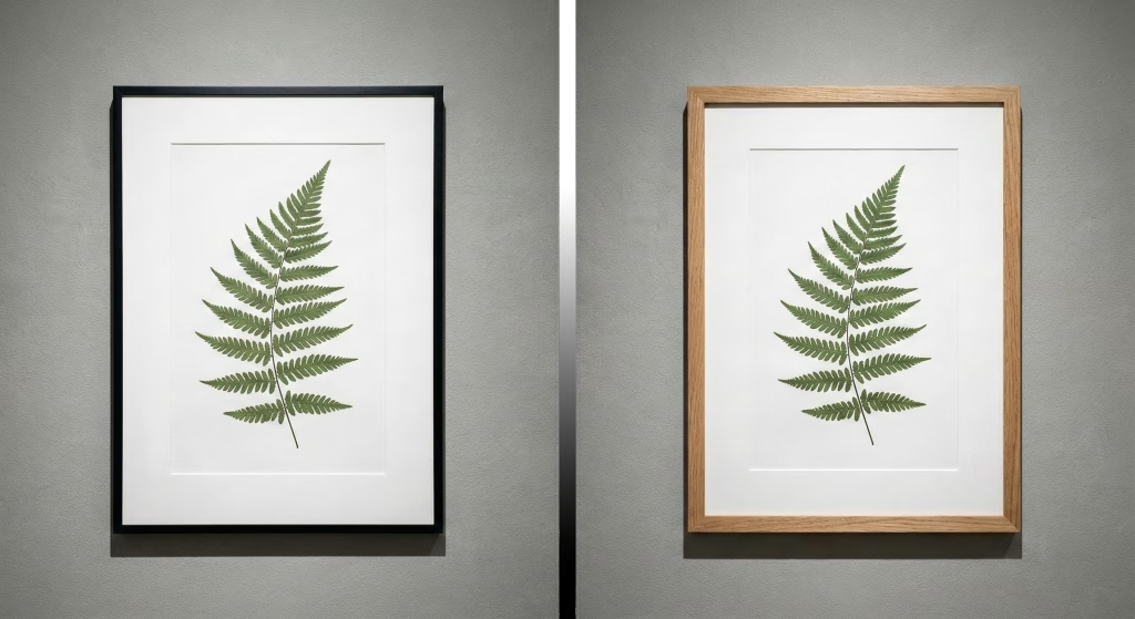
(Featured image: Comparison photo of two frames, gold and black. Photo by VanVakarnee)
We have covered color and frames, but what should the picture actually be?
1. Landscapes as Windows Think of a gray room as a box. If you don’t have a great view outside, create one. A landscape print acts as a “window.” To warm up the room, choose landscapes that feature warmth.
2. Textured Abstracts Even if a print is flat paper, the image can convey texture. Look for art that features photographs of brush strokes, canvas weave, fabric, or stone. Gray paint is usually very smooth. Adding visual texture through art breaks up the monotony and adds depth, making the walls feel richer and more interesting.
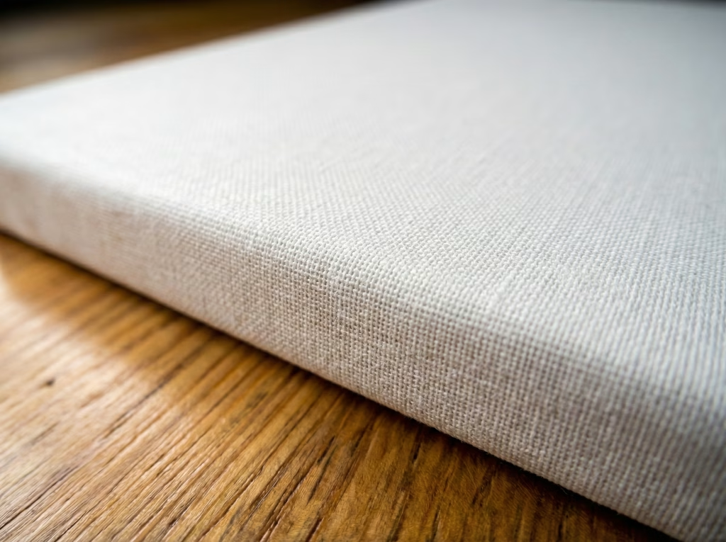
(Featured image: Macro image of woven canvas texture. Photo by VanVakarnee)
Conclusion
Grey walls are popular for a reason, they’re the perfect sophisticated backdrop. But like any blank canvas, it needs the right paint to make it sing.
You don’t need to suffer through a cold living room. By choosing art with warm undertones (terracotta, gold, green) and framing it in natural wood, you can completely transform the mood of your home from “cloudy day” to “golden hour.”
Ready to warm up your space? Browse our curated collections at VanVakarnee to find the prints that bring the heat.