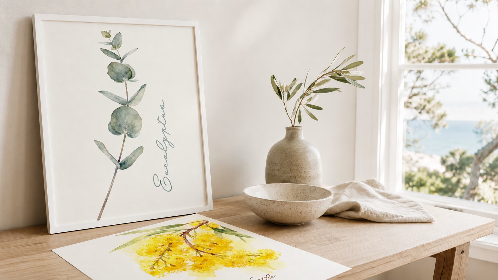
Bathroom Wall Art Prints for Small Bathrooms, Ensuites, & Half Bathrooms
By Anne N.May 23, 2026 | 10:00 AM AEST (Featured image: Icy Leaves framed botanical bathroom wall art print beside a white vanity, brushed…
By Anne N.
January 28, 2026 | 9:19 AM AEST
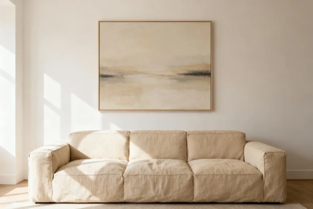
(Featured image: Large Neutral Abstract Wall Art. Photo by VanVakarnee.)
There is a common misconception in interior design that a luxurious home requires an unlimited budget. We often assume that to achieve that high-end, curated aesthetic, the kind you see in glossy architectural digest spreads or boutique hotels, you must invest in original oil paintings or limited-edition sculptures.
The reality is far more accessible. The difference between a room that feels “student rental” and one that feels “penthouse suite” rarely comes down to the price tag of the décor. It comes down to intention. It is about how you select, frame, and display your pieces.
When you know what to look for, you can bypass the gallery markups and find luxury cheap wall art prints that mimic the sophistication of high-value investments. Whether you are refreshing a tired living space or adding character to a new build, the secret lies in the details: the weight of the paper, the depth of the blacks in the ink, the scale of the frame, and the relationship the art has with the rest of your room.
This guide will walk you through the practical steps of choosing wall art that elevates your home, proving that premium style is less about how much you spend and more about how you choose.
If there is one mistake that instantly cheapens the look of a room, it is undersized artwork. A small print floating alone on a vast expanse of plasterboard looks apologetic and unintentional. In the world of high-end interiors, confidence is key, and confidence often translates to size.
Large wall prints are a hallmark of expensive-looking interiors. A single, substantial piece acts as an anchor for the room, creating a focal point that commands attention. When selecting wall art for living room spaces, particularly above a sofa, the artwork should generally span two-thirds to three-quarters of the width of the furniture below it.
If you hang a tiny A4 print above a three-seater sofa, the proportion is off-balance. The furniture swallows the art. By opting for a large-scale piece… think A1, A0, or 60x90cm and above—you create a sense of grandeur. It suggests that the space was designed around the art, rather than the art being an afterthought.
While size matters, so does breathing room. A large print needs negative space around it to shine. Crowding a massive piece into a corner or jamming it against a doorframe creates visual tension. Luxury is about ease; allow your modern wall art to have a generous border of wall space around it. This “white space” acts similarly to a mat board in a frame—it isolates the image and gives it importance.
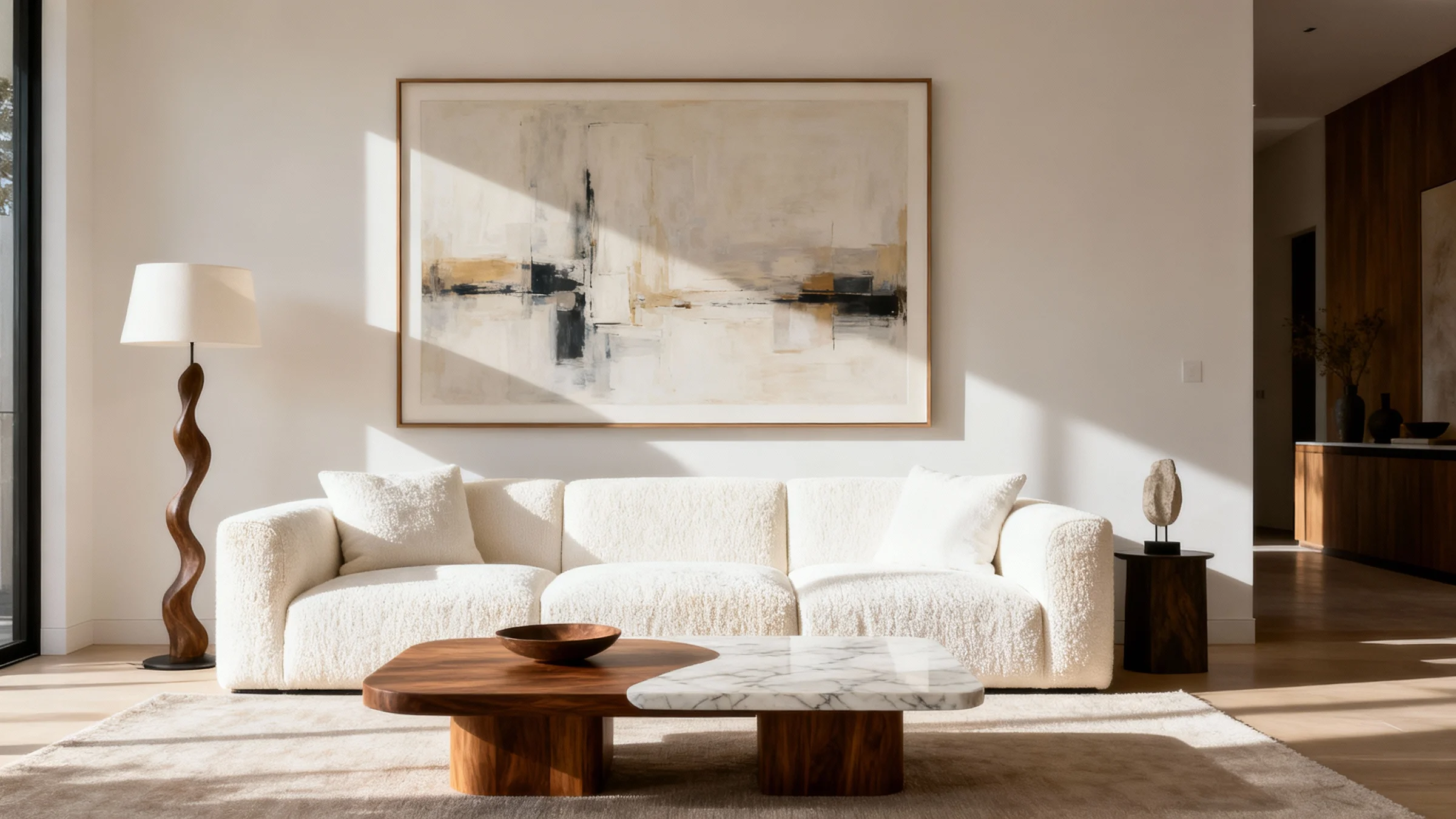
(Featured image: Large Abstract Canvas in Neutral Tones. Photo by VanVakarnee.)
You cannot fake good texture. When searching for art prints for home decoration, the physical material of the print is the single biggest indicator of quality.
Cheap, mass-market posters are often printed on thin, glossy paper (usually around 130gsm). This paper reflects light unevenly, ripples under glass, and lacks depth. It looks like a flyer, not art. To make a room look expensive, you must prioritise high quality wall prints produced on archival-grade paper.
When you purchase from a dedicated online wall art store rather than a general marketplace, you are paying for these substrates. The image might look the same on a screen, but on your wall, the difference between a flimsy poster and a cotton-rag print is night and day.
You could buy a moderately priced print, but if you frame it like a masterpiece, it will look like a masterpiece. Conversely, you could buy a rare lithograph and ruin it with a cheap, clip-on plastic frame.
Framing is where you have the most control over the “luxury factor.”
In the art world, a mount (or mat board) is the card border that surrounds the print within the frame. Including a mount is the quickest way to elevate luxury cheap wall art prints. It adds physical depth, separating the glass from the artwork, and increases the overall footprint of the piece.
For a truly high-end look, consider an exaggerated mount. For example, place a smaller A4 print inside a large A2 frame with a wide, white mat. This technique is often used in galleries to draw the eye in and make small artworks feel precious and significant.
Avoid shiny plastic frames that look like faux wood. Stick to natural materials or high-quality finishes:
(Featured image: Close-up of a solid wood picture frame corner with a mitred joint. Photo by VanVakarnee.)
Expensive-looking interiors rarely happen by accident; they are curated. When choosing premium wall art, you must consider the existing colour palette of your room.
A classic interior design rule is the 60-30-10 ratio. 60% of the room is your dominant colour (walls, large rugs), 30% is your secondary colour (furniture, curtains), and 10% is your accent colour (cushions, vases, art).
Your wall art can either reinforce the secondary colour or provide that 10% accent. For a serene, monochromatic look—very popular in luxury Australian homes—choose art that stays within the tonal range of your walls and furniture. Sepia tones, charcoals, creams, and sage greens work beautifully here.
If your room feels flat, use art to inject the accent colour. A vibrant abstract piece in a neutral grey room can look incredibly chic, provided it is the only major source of that chaotic energy.
To make the art feel integrated, pick out one subtle colour in the print and repeat it elsewhere in the room. If your bedroom wall art features specks of terracotta, add a terracotta throw to the bed. This subtle repetition signals to the brain that the room was designed holistically.
(Featured image: Framed botanical artwork with green tropical leaves displayed above a bed with green linen bedding. Photo by VanVakarnee.)
How you arrange the art is just as important as the art itself. There are two main approaches to a luxury aesthetic: the solitary statement and the curated gallery.
As mentioned in the section on scale, a single large artwork exudes confidence. It is a “less is more” approach that works exceptionally well with minimalist wall art. It declutters the visual field and allows the viewer to appreciate the details of the single image. This is often the preferred method for modern, architectural homes.
Gallery wall ideas are abundant on Pinterest, but executing them with a high-end feel requires discipline. A “messy” gallery wall can look chaotic and cheap. To make it look expensive:
(Featured image: Six black square picture frames arranged in a grid on a white wall. Photo by VanVakarnee.)
Subject matter is subjective, but certain styles historically read as more “high-end” than others.
Abstract Wall Prints: Abstract art is a staple of luxury interiors because it is open to interpretation. It evokes emotion and mood without dictating a narrative. Fluid shapes, broad brushstrokes, and colour fields tend to look sophisticated. They add texture and movement to a room without adding visual clutter.
Nature and Botanicals: In Australia, our connection to the landscape is vital. High-resolution photographic prints of landscapes or detailed botanical illustrations bring the outdoors in. However, avoid generic stock photos. Look for moody landscapes, misty forests, or macro photography that focuses on texture rather than just a “pretty sunset.”
Typography: Be cautious with typography. While popular, “Live Laugh Love” style quotes can date a room quickly. If you love typography, opt for graphic, bold Bauhaus-style lettering or exhibition posters that treat text as a design element rather than just a message.
Image Recommendation 5 Placement: After the “Abstract Wall Prints” paragraph. Alt text: A modern living room corner featuring a large abstract painting with fluid blue and gold shapes. Caption: Abstract art adds sophistication and visual interest without overwhelming the narrative of the space.
We have discussed the importance of paper weight, archival inks, and curated design. The challenge for many homeowners is finding a source that ticks all these boxes without charging thousands of dollars.
This is where Vanvakarnee sits in the market. We understand that discerning buyers want premium wall art that feels authentic and substantial. We don’t just print images; we curate a collection for the modern home, ensuring that every piece—from the deepest black ink to the texture of the paper—meets a standard of excellence.
When you browse our collection, you aren’t sifting through millions of generic images. You are viewing a refined selection designed to work in real homes. Whether you are hunting for high quality wall prints to complete a renovation or a simple piece to brighten a hallway, our focus remains on materiality and design integrity. It is the accessible way to bring that “gallery” feel into your everyday life.
(Featured image: Close-up of white gloss paper showing clean cut edge and smooth surface texture. Photo by VanVakarnee.)
You have bought the perfect print. You have framed it beautifully. Do not stumble at the finish line with poor installation.
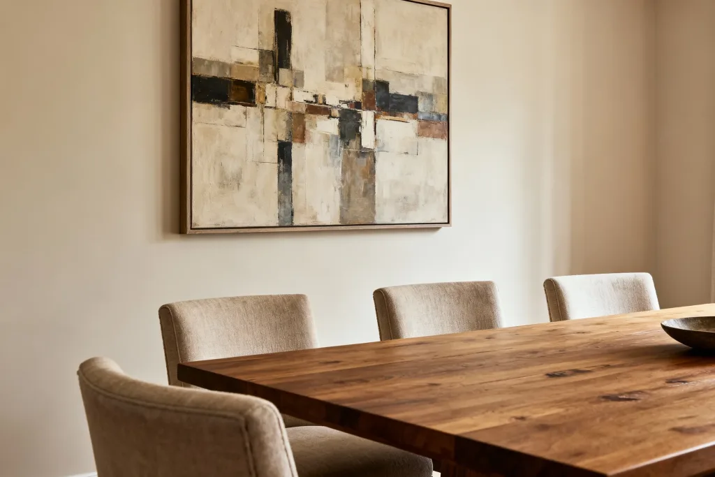
(Featured image: Framed abstract artwork hanging above a wooden dining table with upholstered chairs. Photo by VanVakarnee.)
Creating a home that looks expensive isn’t about deception; it is about care. It is about selecting wall art prints that resonate with your style, ensuring they are produced on quality materials, and giving them the space and framing they deserve.
By paying attention to scale, texture, and placement, you can transform luxury cheap wall art prints into stunning focal points that define your home. It is your space—curate it with confidence.
Ready to find the perfect piece for your home? Browse the Vanvakarnee Shop to discover art that elevates your everyday.