Bathroom Wall Art Prints for Small Bathrooms, Ensuites, & Half Bathrooms
By Anne N.May 23, 2026 | 10:00 AM AEST (Featured image: Icy Leaves framed botanical bathroom wall art print beside a white vanity, brushed…
By Angus W.
April 8, 2026 | 11:00 PM AEST
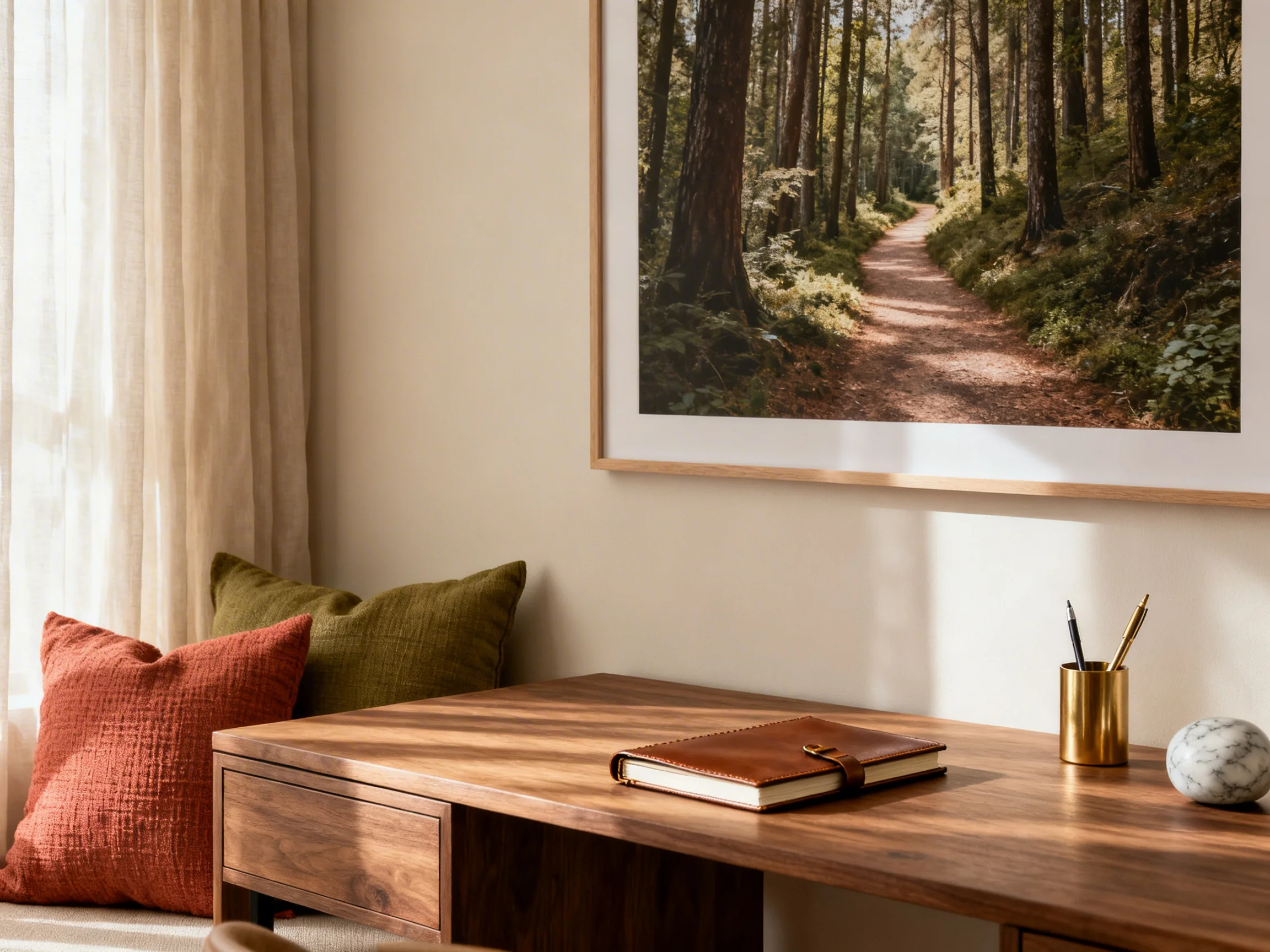
(Featured image: A serene home office setup featuring a large, framed woodland path photograph above a rich walnut desk. The scene is bathed in natural sunlight, with a leather notebook, a brass pen cup, and soft linen curtains adding to the restorative atmosphere. Photo by VanVakarnee)
Oversized, nature-led artwork has moved from a pleasant finishing touch to a defining feature of sophisticated interiors. The shift makes sense. Rooms are being edited more carefully now, with fewer objects, stronger focal points, and a greater interest in spaces that feel restorative rather than merely decorated.
Modern decorating standards for wellbeing explicitly treat natural images, colors, materials, and patterns as valid ways to bring the natural environment into an interior. Furthermore, professional restorative-space guidance links calming colors, textures, and forms to mental relief. In other words, the instinct to use large-scale nature wall art in quieter homes is not just a matter of aesthetic taste; it aligns with recognized frameworks for environmental wellness.
In the years that I’ve been working on my own home and giving styling advice to others, I have consistently seen one resolved piece of art do more than an entire gallery wall. It steadies the tonal palette, sets the emotional register of the room, and gives the eye a proper place to land. When the image is nature-based, that effect is amplified. A mist line through trees, a weathered shoreline, or a slow horizon photograph can introduce calm without flattening the room into bland minimalism.
The result feels warmer, more intentional, and usually more expensive, because luxury in art placement has less to do with quantity and far more to do with scale, restraint, and visual confidence.
A gallery wall can be charming, but in many modern homes, it fragments the architecture. Too many small pieces create visual noise, especially in open-plan rooms where the eye is already working across multiple zones. A single oversized work creates hierarchy. It tells the room what matters.
This principle is rooted in professional lighting and exhibition design. Visual emphasis standards frame hierarchy as a matter of importance, using light and scale to make certain surfaces read as more vital than others. Modern accessibility and design guidance also reinforces the value of clear sightlines to important elements for all users.
Applied at home, that means the best wall art placements are rarely random. They sit where the room naturally wants a focal point, and where the artwork can be read clearly from both the main seat and the main entry. This is exactly why biophilic nature wall art is overtaking decorative filler. One calm, compositionally strong piece can hold a room on its own.
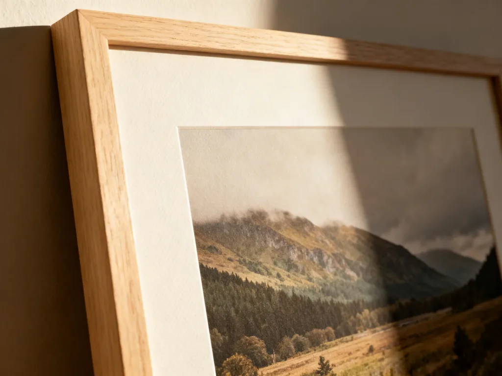
(Featured image: A close-up of a framed fine art print featuring a misty mountain landscape. The natural side light highlights the textured paper and the smooth, pale oak frame, casting soft, architectural shadows. Photo by VanVakarnee.)
Nature photography works in refined homes because it brings depth without demanding noise. In design terms, it supports a calm tonal palette while still giving the room texture, atmosphere, and visual narrative.
That matters deeply in warm minimal, biophilic, and Japandi spaces. These schemes are usually built on restraint, tactile materials, and careful color temperature. Art has to support that balance, not interrupt it. The best nature wall art for these interiors tends to share a few characteristics:
With Japandi styling, I push this further. Look for stillness, asymmetry, and compositional breathing room. A misty forest with softened edges will usually sit better in a Japandi bedroom than a highly saturated waterfall scene, even if both are technically beautiful.
- Pro Tip: Choose the image for its structure first and its location second. A famous landscape is not automatically right for your room. Calm comes from composition, not from subject matter alone.
The mistake I see most often in residential styling is caution. People buy art that is technically beautiful but visibly too small, then wonder why the room still feels unfinished. Large-scale work needs enough span to connect to the furniture beneath it, and enough negative space around it to feel deliberate.
Negative space is equally important. The more breathing room you leave around a statement piece, the more valuable it tends to look. Crowding a large print with sconces, shelves, vases, and side furniture reduces its authority.
Lighting can make an expensive print look flat, or make a restrained piece suddenly feel exceptional. Standard lighting metrics describe color temperature on the Kelvin scale, from warm to cool. In practical terms, color temperature changes how warm or cool the room reads, and that alters the mood of the artwork with it.
Warm light tends to flatter oak, linen, clay, and sand-toned imagery. Cooler light can sharpen blue and grey scenes but may also drain warmth from a soft coastal or woodland print.
Gloss and texture deserve their own attention. A front-facing downlight can produce glare across glazed work. Side light, by contrast, often reveals paper grain, deckled edges, or the subtle character of a textured substrate. This is one of the quiet differences between a print that looks expensive and one that looks mass-produced.
Most errors are not about taste; they are about calibration. Avoid these common pitfalls:
Design Note: Avoid placing artwork on both sides of a small room directly opposite each other. This creates a “canyon” effect that can feel claustrophobic. Instead, stagger the artwork or keep one wall completely bare to allow the eye to rest. If you’re room is large and spacious, you might want to do the opposite and intentionally place them opposite to draw the eye in.
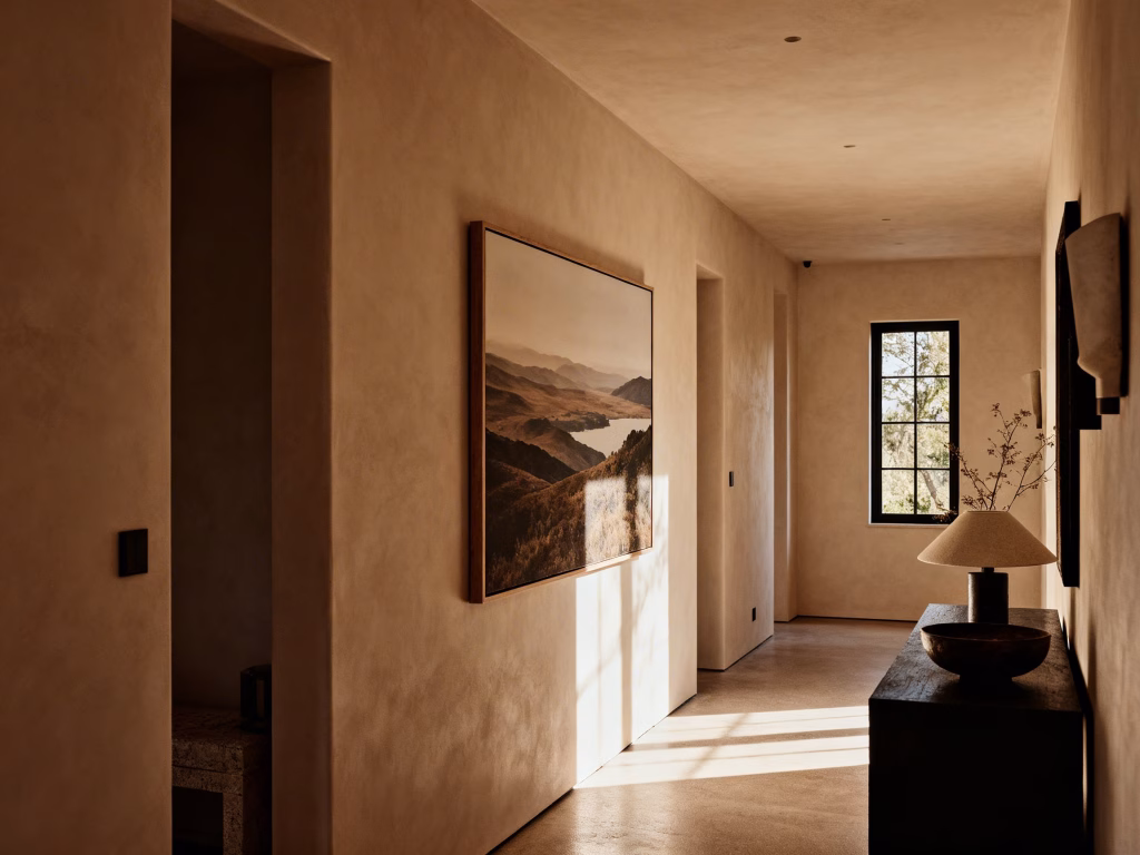
(Featured image: A softly lit, warm-toned hallway with textured plaster walls. A large, framed landscape photograph of a distant lake and rolling hills hangs perfectly positioned, catching the natural sunlight and giving the corridor a calm, composed focal point. Photo by VanVakarnee.)
The best large-scale nature wall art does not simply fill a blank space. It shapes the room’s emotional temperature, controls visual weight, and makes the interior feel more settled.
The answer is not to buy the biggest print you can find. It is to choose a piece with the right scale, the right tonal palette, the right substrate, and the right placement for the way the room is actually used. Give it negative space. Light it with care. Frame it in a way that supports the architecture. That is how nature wall art turns a home from merely tidy into calm, warm, and quietly luxurious.
At Vanvakarnee, we specialise in premium, gallery-quality prints designed to elevate Australian interiors. Our collections are curated to offer distinct styles—from minimalist abstracts that suit tight apartment corridors to bold, luxurious statement pieces perfect for the end of a terrace hallway.
We understand that online wall art store shopping can be difficult when trying to gauge texture and quality. That is why we focus on high-resolution, meticulously detailed prints that hold up to the “close scrutiny” test—essential for hallways where your guests will be viewing the art from just inches away.
Whether you are looking to create a linear gallery or find that one perfect vertical piece to lift your ceiling height, our range is designed to help you finish your home with confidence.
1. What is the best frame for nature wall art? For calming, biophilic, or Japandi interiors, natural woods like light oak, ash, or walnut are ideal because they complement the organic subject matter. If you are aiming for a more modern, high-contrast look, a thin matte black metal frame provides a beautiful, sharp finish.
2. How high should I hang a large nature print? The center of the artwork should generally be at eye level, which is roughly 145cm to 150cm (57 to 60 inches) from the floor. If you are hanging it above a sofa or bed, ensure the bottom edge of the frame sits about 15cm to 25cm (6 to 10 inches) above the top of the furniture to maintain a visual connection.
3. Should I choose canvas or framed paper for landscape art? It depends on the “vibe” and the light in your room. Framed fine art paper with low-glare glass provides a crisp, high-end gallery aesthetic that highlights the sharp details of photography. Canvas offers a softer, more painterly finish and avoids glass glare entirely, which is helpful in rooms with heavy direct sunlight.
4. Does the color of the art have to match my cushions? Not exactly. It’s better to think about the tonal palette rather than an exact color match. If your room is full of warm earth tones, a print with sandy beiges or muted forest greens will feel more “at home” than a vibrant, neon-blue ocean shot. The art should settle the room, not fight it.
5. Can I put large art in a small room? Surprisingly, yes. A common mistake is thinking small rooms need small art. In reality, lots of small pieces can make a tiny room feel cluttered and “bitty.” One large, expansive landscape can actually push the walls out visually and make a small space feel significantly larger and more intentional.
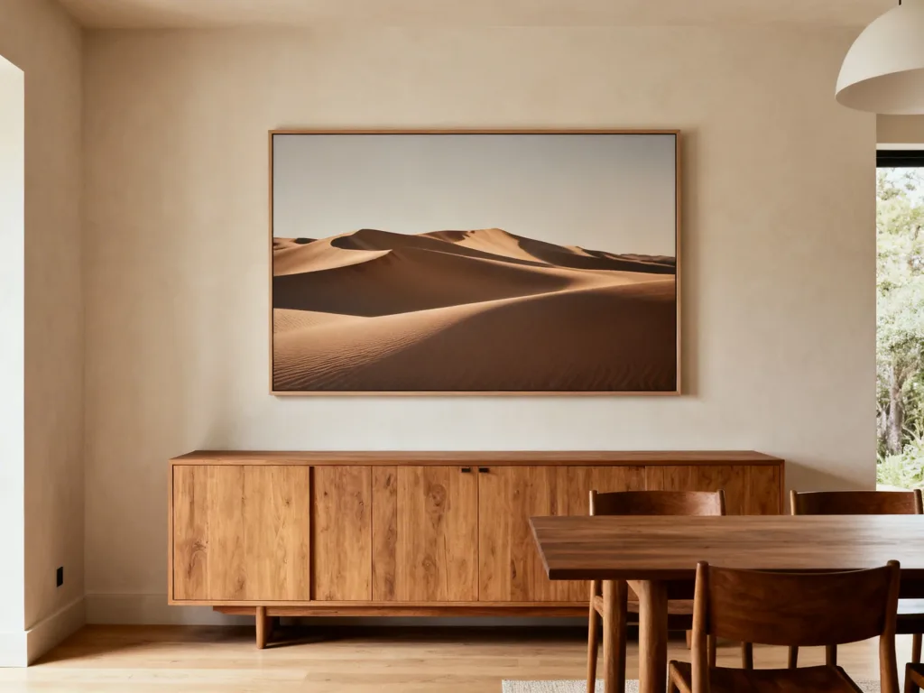
(Featured image: A warm, neutral dining space featuring a large, framed photograph of sweeping desert dunes. The oversized nature wall art hangs with ideal proportions above a long, natural timber sideboard, complemented by the wooden dining set and clear negative space. Photo by VanVakarnee.)