Canvas vs Framed Prints: Best Wall Art for Australian Homes
Canvas vs framed prints depends on light, scale and style. Compare glare, weight, framing and room fit before choosing wall art for your Australian…
By Anne N.
August 19, 2026 | 5:00 PM AEST
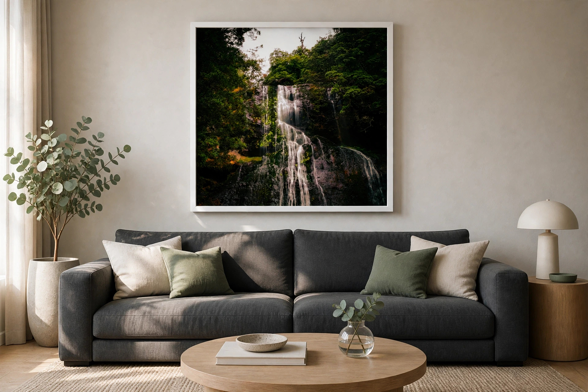
(Emerald Veil wall art bringing deep forest green, moving water and natural contrast to a charcoal-grey sofa. Photo by VanVakarnee.)
Quick answer: the best wall art for a grey sofa adds either warmth or deliberate contrast. Rust, ochre, forest green, ocean blue, cream, blush and warm timber tones all work well. Size the complete artwork arrangement to approximately 60–75% of the sofa width and hang its lowest edge about 15–20 centimetres above the sofa.
A grey sofa is flexible, but that flexibility can make shopping harder. Almost every colour appears possible, so the room can end up feeling safe rather than finished. The solution is to identify the sofa’s undertone, choose one colour direction and repeat a small part of the artwork palette elsewhere in the room.
This Australian guide explains colour, scale, frames, canvas, subject matter and placement so you can choose wall art for a grey sofa with confidence—and buy a piece that still feels right after the cushions change.
Grey acts as a neutral foundation. Choosing wall art for a grey sofa becomes easier when you decide whether to soften it, warm it or sharpen the contrast. The strongest result usually has one clear colour story rather than many unrelated accents.
| Grey sofa tone | Wall art colours to try | Overall effect |
|---|---|---|
| Cool light grey | Ocean blue, eucalyptus green, blush, cream | Calm and airy |
| Warm grey | Ochre, rust, terracotta, olive, warm white | Relaxed and welcoming |
| Charcoal | Pale coastlines, white space, gold, vivid green | Strong contrast |
| Greige | Sand, brown, muted blue, burgundy, timber | Soft and layered |
| Blue-grey | Warm stone, orange, copper, golden grasses | Balanced and lively |
You do not need every suggested colour. Choose one dominant family and one supporting accent. A coastal photograph with blue water and warm rock, for example, can connect a cool sofa with timber furniture without making the room look themed.
Cool grey often contains blue, silver or violet undertones. It works naturally with ocean photography, misty landscapes, deep greens and crisp black-and-white images. If the room already feels cold, introduce warm rock, sunset light, ochre or timber through the artwork and frame.
Warm grey leans towards taupe, mushroom or brown. It pairs beautifully with earthy Australian landscapes, rust, olive, golden grasses, cream and muted blue. Black frames can create definition; natural timber keeps the result quiet and cohesive.
Charcoal has enough visual weight to support large, bright artwork. Look for pale sky, water, sand, white flowers or luminous mist. A small dark print can disappear above a charcoal sofa, so prioritise contrast and sufficient finished width.
Colour attracts attention, but scale makes the artwork feel connected to the furniture. Measure the sofa from the outside of one arm to the outside of the other, then multiply that width by 0.60 and 0.75.
Sofa width × 0.60 = minimum suggested art width
Sofa width × 0.75 = maximum suggested art width
| Sofa width | Suggested finished artwork width | Arrangement idea |
|---|---|---|
| 140 cm | 84–105 cm | One horizontal print |
| 160 cm | 96–120 cm | One large artwork or compact pair |
| 180 cm | 108–135 cm | Large landscape or portrait pair |
| 200 cm | 120–150 cm | Statement piece, pair or trio |
| 220 cm | 132–165 cm | Wide pair or three-print set |
| 240 cm | 144–180 cm | Large grouped arrangement |
Include the outside frame, mat and gaps between multiple prints. Standard A-series paper dimensions are defined by ISO 216, but always use the product’s finished external frame dimensions for your sofa calculation. For a complete room-by-room calculation, use the Australian sofa wall art size guide.
Blue wall art reinforces the calm quality of grey while making the room feel more open. Choose images that also contain sand, warm stone, cream or timber so the palette does not become entirely cool. Coastal photography works particularly well in bright Australian living rooms and open-plan spaces.
Forest green, eucalyptus and moss tones bring life to grey upholstery. Green is useful when the room contains indoor plants or views of a garden because it connects the interior with the outdoors. A pale timber frame can keep the combination gentle; black creates a cleaner contemporary edge.
Warm earth colours are an effective counterweight to cool grey. They can be introduced through cliffs, streetscapes, evening light, autumn leaves or architectural details. Repeat a small rust or ochre note in a cushion or ceramic object instead of trying to match every colour exactly.
Black-and-white photography creates a controlled, graphic look. It is strongest when the room includes texture—linen, wool, timber, stone or plants—so the palette does not feel flat. Use a generous mat or larger finished frame to give the image presence above a wide sofa.
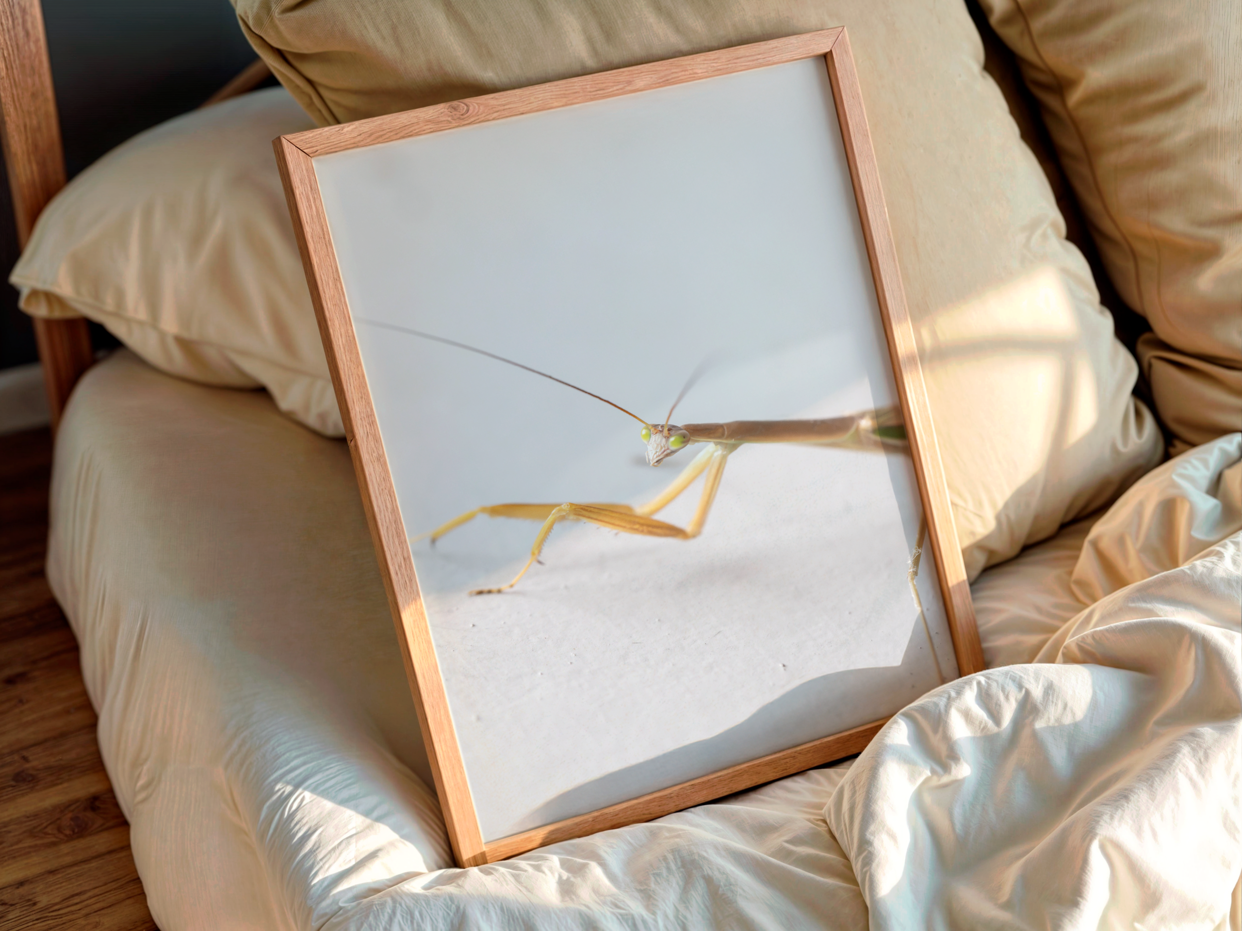
Both formats work. Choose canvas when you want a lighter, gallery-like object without reflective glazing. Choose a framed paper print when the frame needs to connect with timber, black metal or white architectural details elsewhere in the room.
| Format | Best for | Consider |
|---|---|---|
| Canvas | Large statement pieces, bright rooms, softer finish | Check edge treatment and canvas depth |
| Natural timber frame | Warm grey, Scandinavian and coastal rooms | Include the frame in finished dimensions |
| Black frame | Charcoal sofas and contemporary spaces | Use a pale image or mat for contrast |
| White frame | Light grey sofas and airy interiors | Avoid losing the frame against a white wall |
If you are still deciding between formats, see the available Van Vakarnee art print options and compare the finished size, hanging method and way each surface responds to light.
Good wall art for a grey sofa connects the room without looking copied. A grey sofa does not require grey artwork. In fact, a print containing no obvious grey can work beautifully when its frame, scale and one supporting colour relate to the rest of the space.
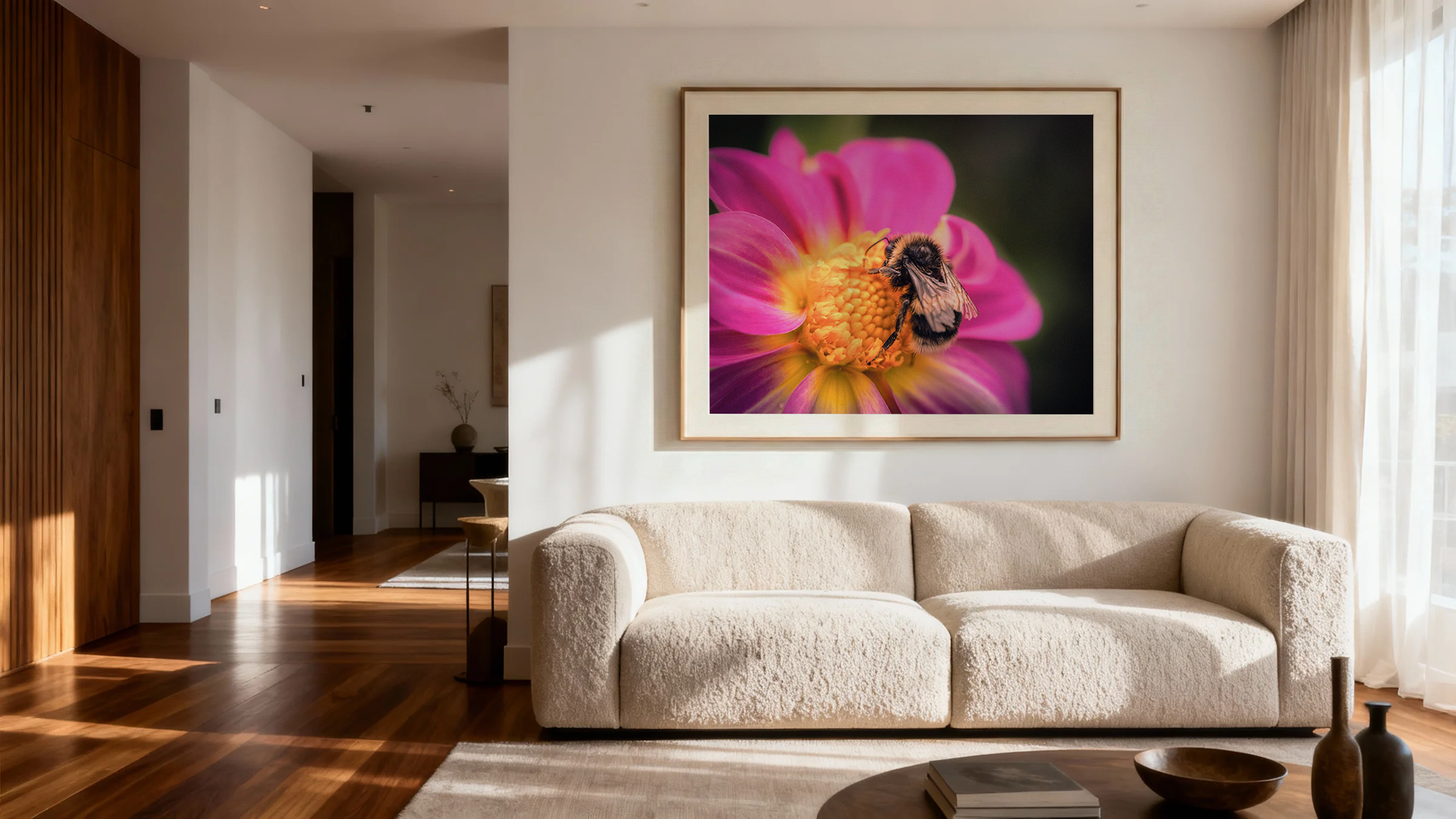
A small print can look stranded above a broad sofa. Measure first and test the finished outline with painter’s tape.
Grey artwork, grey cushions and grey walls can remove the focal point. Add at least one clear colour or strong light-dark contrast.
A blue-grey sofa and yellow-beige frame can clash when nothing else connects them. Repeat the warmer tone elsewhere or choose a cooler frame.
Keep approximately 15–20 centimetres between the sofa and the lowest artwork edge so both elements read as one arrangement.
Compare centimetre dimensions and inspect the image at the distance from which it will normally be viewed.
Choose the palette first, then compare the available print sizes with your measured wall.
Blue, green, rust, ochre, cream, blush and warm brown all work. Choose according to whether the sofa has a cool, warm or charcoal undertone.
No. Wall art for a grey sofa should connect with the complete room rather than copy the upholstery. Repeat one artwork colour in a cushion, rug or object.
A 200-centimetre sofa generally suits an artwork or complete arrangement approximately 120–150 centimetres wide.
Yes. Forest, eucalyptus and olive tones add natural colour without fighting the neutral sofa. They work especially well with plants and timber.
Black creates a crisp contemporary line, while natural timber adds warmth. Choose a pale or colourful image so the arrangement remains visible.
Canvas offers a light, non-reflective statement piece. A framed print gives more control over the border, mat and connection with existing furniture.
The right wall art for a grey sofa makes the neutral upholstery feel intentional. Identify the undertone, choose one colour direction, calculate the correct width and test the finished dimensions before ordering.