Bathroom Wall Art Prints for Small Bathrooms, Ensuites, & Half Bathrooms
By Anne N.May 23, 2026 | 10:00 AM AEST (Featured image: Icy Leaves framed botanical bathroom wall art print beside a white vanity, brushed…
By Anne N.
May 3, 2026 | 1:45 PM AEST
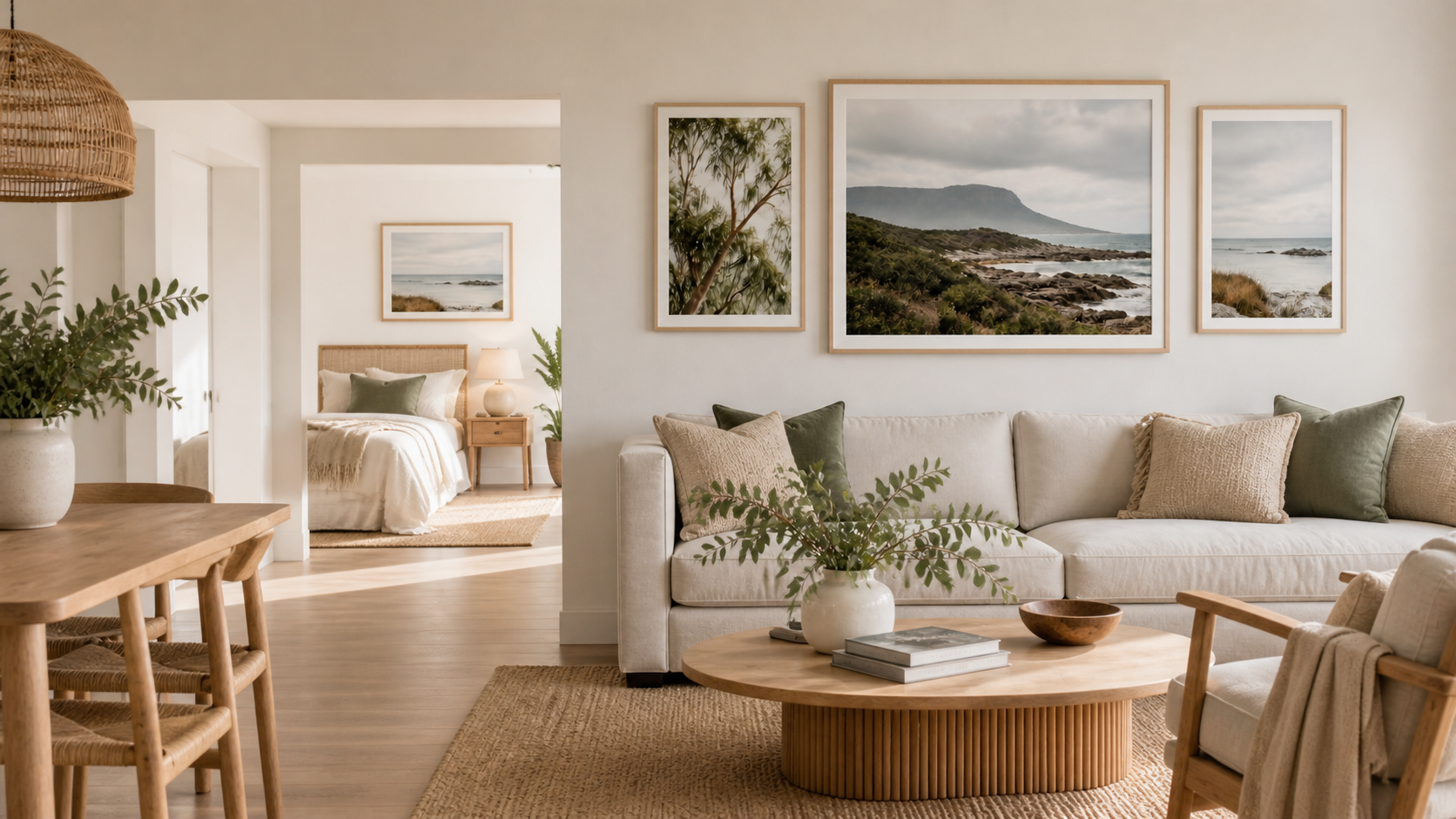
(Featured image: A calm living room styled with three coordinated wall art prints above a neutral sofa, using warm natural tones, balanced spacing, and soft Australian-inspired interiors. Photo by VanVakarnee.)
There is a certain point where a room stops feeling furnished and starts feeling finished.
The furniture might be right. The rug might suit the space. The lighting might feel warm. But if the wall above the sofa, bed, console, or hallway bench is still blank, the whole room can feel slightly unfinished.
That is where a set of three wall art prints can work beautifully.
A single large print can make a strong statement, but three prints create rhythm. They let colour move across the wall. They make a room feel more layered without making it feel crowded. They can also help connect different parts of a home, especially in living rooms, bedrooms, entryways, and holiday rentals.
The trick is not to choose three random prints and hope they work together. The best wall art sets usually have a quiet structure.
One print leads.
One print supports.
One print softens.
This guide walks through how to choose a wall art set of 3 that feels balanced, natural, and easy to live with.
Before choosing any artwork, look at the room itself.
Is it calm and neutral? Warm and earthy? Coastal and light? Soft and feminine? Bold and modern? Minimal and quiet?
The artwork should add to that feeling, not fight against it.
A bedroom might need softer prints with gentle colour and less contrast. A living room with timber furniture might suit warmer landscapes, botanical details, or earthy abstract pieces. A coastal home might feel better with open space, soft blues, sandy neutrals, and lighter compositions.
The goal is not to match every colour exactly. It is to make the room feel like one thought.
Natural imagery is often a useful starting point because it tends to sit comfortably in many homes. The Victorian Health Building Authority’s guide to biophilic design explains how visual references to nature, natural colours, and organic forms can help built environments feel more connected and calming.
That does not mean every room needs a forest print or a beach scene. It simply means that nature-based colours, textures, and shapes can be an easy way to make a room feel more settled.
Not louder.
Not busier.
More settled.
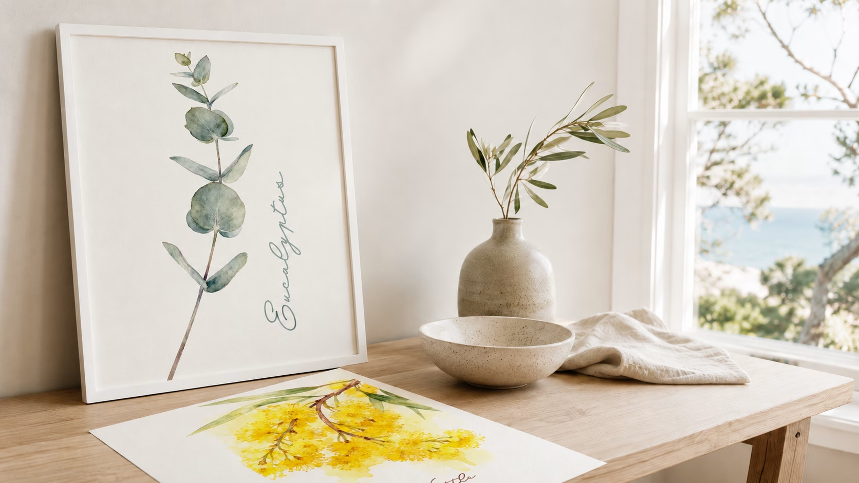
(Image: Three complementary wall art prints laid out together before hanging, showing one landscape-style print, one softer supporting piece, and one quieter detail print. Photo by VanVakarnee.)
Every set of three needs a starting point.
This is the hero print.
The hero print is the piece that carries the mood of the room. It might be the largest print, the strongest composition, or simply the artwork your eye goes to first. It does not need to be loud. It just needs enough presence to anchor the group.
A hero print could be a wide landscape, a detailed botanical image, a bold abstract piece, a quiet photograph with beautiful light, or a print with colours that already suit the room.
Once you have chosen the hero print, the other two pieces become easier.
You are no longer asking, “What else do I like?”
You are asking, “What would help this first print feel at home?”
That one change makes the whole process simpler.
The second print should connect to the hero piece without copying it.
If the hero print has soft blues and greys, the supporting print might include sky, water, mist, stone, pale neutrals, or gentle shadow. If the hero print is warm and earthy, the second piece might include sand, timber, dry grass, rust, gold, or soft brown tones.
The connection can be subtle.
It might be the colour palette.
It might be the subject.
It might be the movement.
It might simply be the feeling.
This is usually better than choosing three prints that are too similar. A set can start to feel flat if every piece has the same subject, same size, same colour, and same visual weight.
The supporting print should make the hero print feel more complete. It should not compete with it.
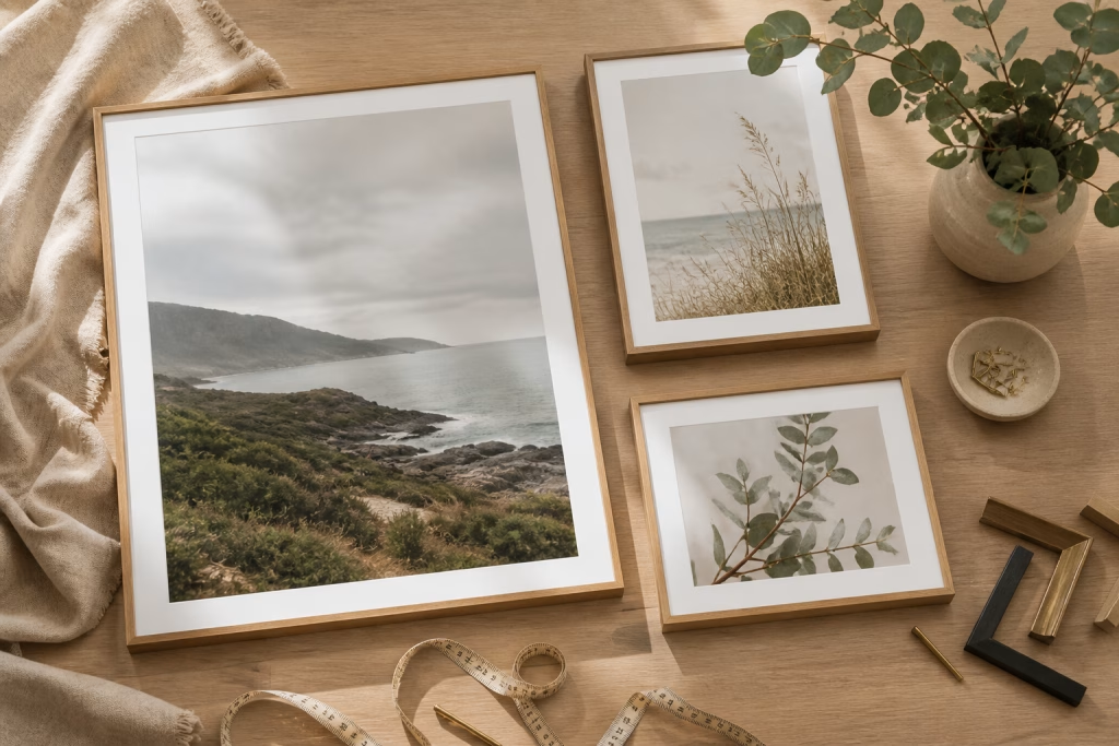
(Image: A hero wall print paired beside a softer supporting print with related colours, showing how two different artworks can still feel connected. Photo by VanVakarnee.)
The third print is where the set gets breathing room.
A common mistake is choosing three equally strong pieces. Each print might look beautiful on its own, but together they can make the wall feel busy. A quieter third print helps balance the group.
This could be a softer landscape, a simple botanical detail, a minimal abstract, a close-up texture, or a print with more negative space.
Think of it like styling a room.
Not every object can be the feature. If the sofa, rug, cushions, lamp, coffee table, and artwork all demand attention, the room can feel restless. A good wall art set needs hierarchy.
One piece leads.
One piece supports.
One piece gives the eye somewhere softer to land.
That is what makes the set feel natural rather than forced.
Colour is one of the easiest ways to connect three prints, but it can also make a room feel too controlled if everything matches perfectly.
A better approach is to repeat colour families rather than exact shades.
For example:
Warm neutrals, sand, cream, and soft brown.
Sage green, eucalyptus, grey, and white.
Soft blue, pale grey, stone, and mist.
Black, white, charcoal, and natural timber.
Dusty pink, cream, muted green, and warm beige.
The Victorian Department of Health’s guidance on interior design and colour explains that colour can affect people physically and emotionally, and that too many colours used together can become distracting. While that advice is written for dementia-friendly environments, the broader design idea still applies in everyday homes.
A calmer palette is usually easier to live with.
For wall art, that means the prints do not need to match exactly. They just need to feel like they belong in the same room.
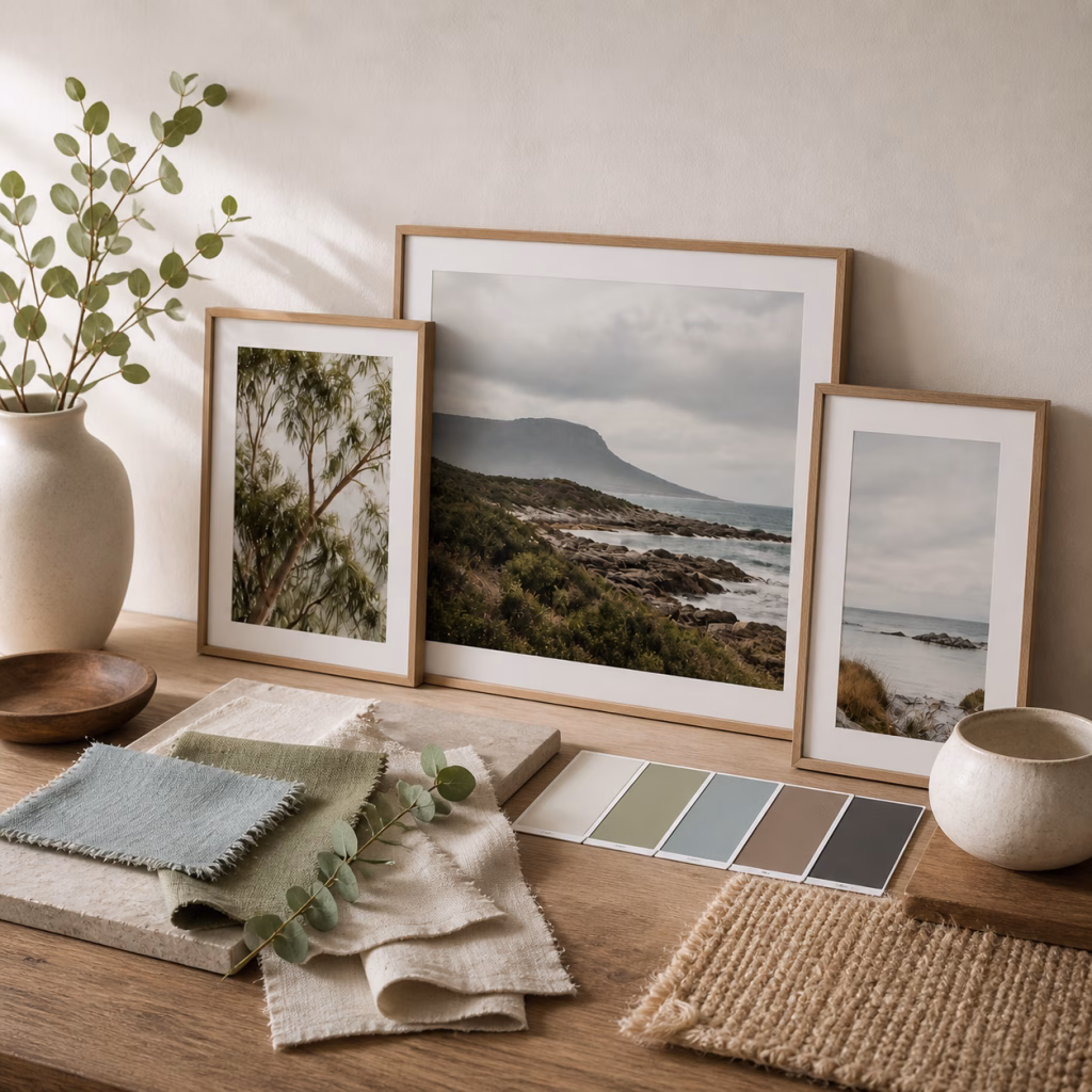
(Image: A simple colour palette mood board beside three coordinated wall prints, using natural tones such as cream, eucalyptus green, warm brown, soft blue, and charcoal. Photo by VanVakarnee.)
A wall art set of 3 should feel connected to the furniture or space around it.
Three tiny prints above a large sofa can make the wall feel even emptier. Three oversized prints in a narrow hallway can feel heavy. The scale needs to suit the room.
As a general starting point, the full arrangement should feel visually related to what sits below it. Above a sofa, bed, sideboard, or console, the set should have enough width and presence to feel anchored.
You can use three prints of the same size for a clean, symmetrical look. Or you can use one larger hero print with two smaller supporting pieces for a more relaxed arrangement.
Before hanging anything, mark the layout with paper or painter’s tape. Step back. Look from the doorway. Sit down if the art will mostly be seen from the sofa or bed. The right height is usually the one that makes the artwork feel part of the room, not like it is floating away from it.
House & Garden’s guide on how to hang pictures gives eye level as a useful starting point, while also noting that artwork in seated spaces may need to sit lower so it feels visually connected.
In simple terms: if the print looks stranded above the furniture, bring it down.
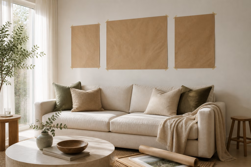
(Image: Paper templates taped above a sofa to plan a three-print wall art layout before hanging. Photo by VanVakarnee.)
Different rooms need different kinds of artwork.
A living room usually needs more presence. A bedroom needs softness. An entryway needs a clear first impression. A holiday rental needs broad appeal and good photography.
The same three prints will not suit every wall.
The living room is usually the best place to start because it is where wall art has the most visual impact.
A good formula is:
One larger landscape or statement print.
One supporting nature, abstract, or architectural piece.
One quieter detail print.
This works well above a sofa, sideboard, fireplace, or reading corner. If the room has neutral furniture, the prints can bring warmth and movement. If the room already has strong colour, keep the artwork more controlled.
The living room does not need art that shouts. It needs art that anchors the space.
Bedroom art should not work too hard.
This is the room where the eye needs to slow down. Soft landscapes, gentle florals, muted abstracts, quiet skies, and natural textures usually work well here.
A good formula is:
One calm hero print above the bed.
Two softer pieces that repeat the same palette elsewhere in the room.
The three prints do not always need to hang together. Sometimes a bedroom feels better when the set is spread across the room, creating a repeated mood rather than one large arrangement.
Avoid anything too sharp, too busy, or too high contrast if the goal is rest.
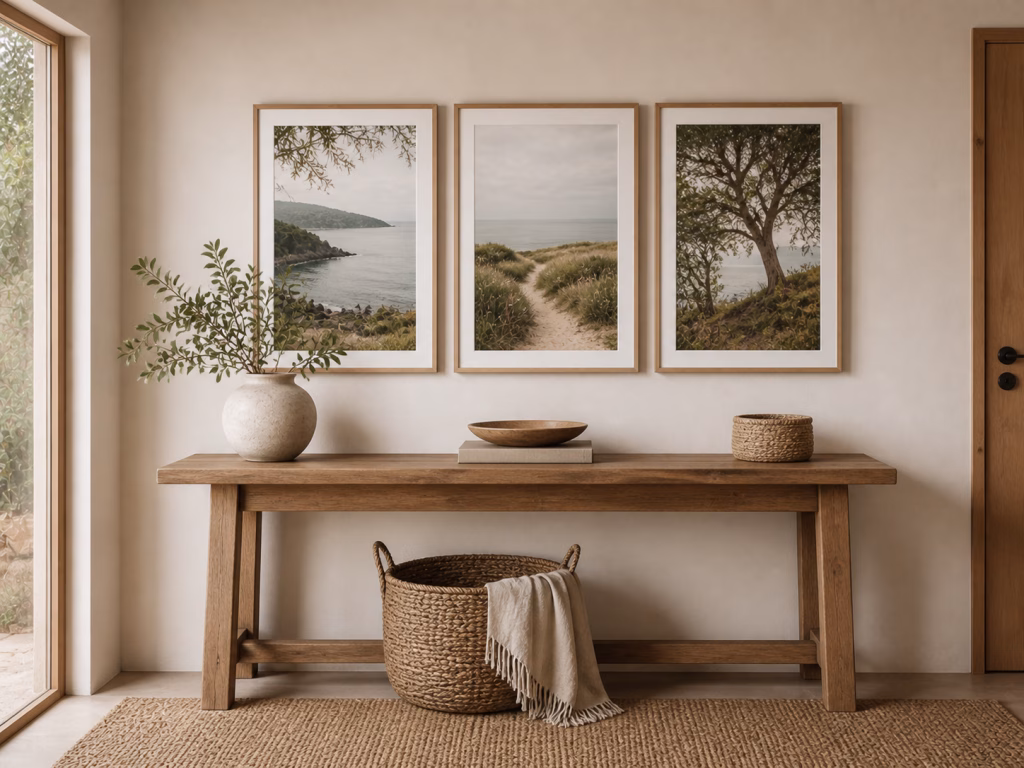
An entryway sets the tone before anyone reaches the living room.
A set of three can work well here, especially if the wall is long, narrow, or connected to a hallway. Vertical prints can be useful in tighter spaces, while a horizontal arrangement can work above a console table.
A good formula is:
One statement piece.
Two smaller prints in the same mood.
The entryway does not need to explain the whole home. It just needs to make the first moment feel considered.
For an Airbnb, holiday rental, or guest space, wall art needs to feel welcoming without becoming too personal.
Nature, coastal, botanical, landscape, abstract, and neutral-toned prints tend to work well because they can appeal to a broad range of guests. A set of three can also help carry a consistent mood through the property.
A good formula is:
One living room hero print.
One bedroom print.
One entryway, hallway, or dining print.
This creates a more connected feel across the property without making every wall look the same.
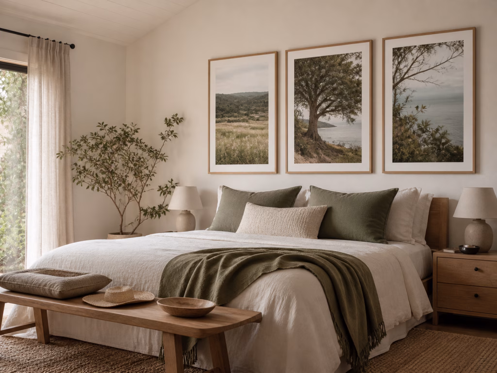
(Image: A warm neutral bedroom styling image showing a three-piece coastal wall art set above a bed, with natural wood furniture, olive green cushions, linen curtains, and soft earthy decor. Photo by VanVakarnee.)
A set of three does not always need to use the same finish.
Canvas can work beautifully for the main piece because it has a softer, more substantial presence on the wall. Paper prints can be ideal for framed supporting pieces, smaller rooms, gallery walls, and more flexible styling.
A simple approach is:
Canvas for the main statement piece.
Paper prints for supporting pieces.
Smaller framed prints for hallways, bedrooms, bathrooms, or secondary spaces.
Keeping the colour palette and mood connected matters more than making every finish identical.
If the room is bright and glare is a concern, canvas may feel softer. If you want crisp detail in a frame, paper may be the better choice.
There is no single correct answer. The right finish is the one that suits the room, the light, and the way the space is used.
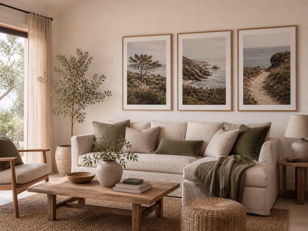
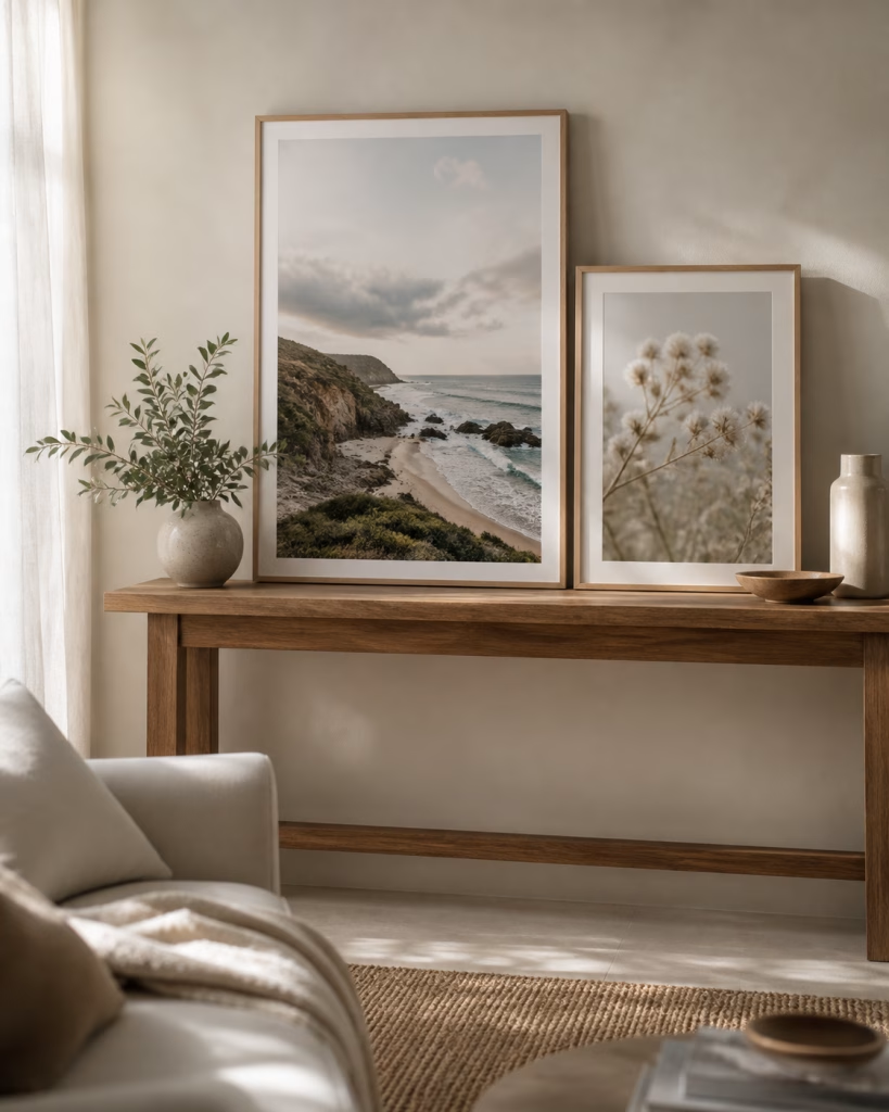
(Image: A warm coastal living room styling image showing a wall art set of three above a linen sofa, with oak furniture, soft beige tones, olive accents, and natural light. Photo by VanVakarnee.)
If choosing a set of three feels overwhelming, keep the structure simple.
This is the main print. It sets the mood and usually has the strongest presence.
This repeats a colour, subject, texture, shape, or feeling from the hero print.
This softens the arrangement and gives the set breathing room.
Then check the room.
Does the set suit the furniture?
Does the palette feel natural in the space?
Is one piece clearly leading?
Is there enough variation between the three prints?
Does the wall feel calmer, warmer, or more complete?
If the answer is yes, the set is probably working.
You are not just filling a blank wall. You are building the feeling of the room.
The biggest mistake is choosing three prints that are all too different.
One coastal print, one bright pop-art poster, and one dark moody abstract might all be interesting on their own. But together, they may not help the room feel more finished. Unless the whole home is intentionally eclectic, the set can start to feel accidental.
Also avoid choosing three pieces with the same visual strength.
If every print is high contrast, highly detailed, and strongly coloured, the wall may feel restless. Give the eye somewhere to pause.
A few simple things to avoid:
Do not make every print the hero.
Do not hang the set too high.
Do not choose pieces that fight the furniture.
Do not introduce too many unrelated colours.
Do not buy too small just because the wall feels intimidating.
The best wall art set of 3 should make the room feel calmer, warmer, or more complete.
If the set makes the room feel busier, it is probably not the right set.
(Image: A finished room with three coordinated wall prints styled above furniture, showing balanced spacing, connected colours, and a calm final look. Photo by VanVakarnee.)
No. They should feel connected, but they do not need to match exactly. A shared colour palette, subject, mood, texture, or style is usually enough.
It can be, especially if you want a clean and symmetrical look. But a larger hero print with two smaller supporting prints can feel more relaxed and natural. The best choice depends on the wall, furniture, and room style.
Living rooms often suit landscapes, nature prints, abstract pieces, coastal scenes, botanical artwork, and prints with enough presence to anchor the wall. The best choice depends on the room’s colour palette and furniture.
Bedroom wall art usually works best when it feels calm and restful. Soft landscapes, florals, muted abstracts, gentle colours, and natural textures are often good choices.
Yes. Mixing canvas and paper prints can work well if the colours and mood are connected. Canvas may suit the main feature piece, while paper prints can work beautifully in frames or smaller spaces.
The spacing depends on the size of the prints and the wall, but the pieces should feel close enough to read as one group. If the gaps are too wide, the set can feel disconnected. If they are too close, the wall may feel cramped.
A wall art set of 3 can make a room feel finished without making it feel overdone.
The key is to avoid choosing three unrelated pieces or three prints that are all trying to be the main feature. Start with one hero print, add one supporting piece, and finish with something quieter.
When the colours, scale, and mood all feel connected, the result is a wall that looks natural, balanced, and considered.
For homes, rentals, and everyday spaces, that is often what good wall art does best. It does not just fill a blank wall. It helps the room feel like it belongs together.
Browse the VanVakarnee wall art collection by room if you are choosing prints for a living room, bedroom, entryway, or holiday home.