Bathroom Wall Art Prints for Small Bathrooms, Ensuites, & Half Bathrooms
By Anne N.May 23, 2026 | 10:00 AM AEST (Featured image: Icy Leaves framed botanical bathroom wall art print beside a white vanity, brushed…
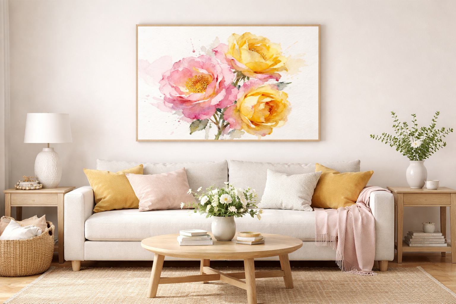
(Featured image: Large abstract watercolor wall prints framed in light oak hanging above a beige sofa in a modern minimalist living room. Photo by VanVakarnee)
There is a specific kind of silence that falls over a room when the art is right. It isn’t just about filling a blank void above a sofa; it is about altering the atmospheric pressure of the space. While oil paintings demand attention with their texture and opacity, and photography captures a precise moment in reality, watercolor wall prints offer something entirely different: a breath of air.
In a design landscape often dominated by hard lines, high-contrast monochrome, and heavy textiles, the fluidity of watercolor provides a necessary architectural exhale. It introduces the concept of “controlled chaos” where pigment bleeds into water, creating boundaries that are felt rather than strictly defined.
Watercolor Wall Prints are high-fidelity reproductions of original watercolor paintings, typically captured using high-resolution scanning technology. To be considered “fine art” or “investment quality,” they must meet three criteria:
We design homes to be lived in, but often forget they must also be felt. The resurgence of watercolor art in high-end interiors isn’t accidental; it correlates directly with a collective desire for psychological sanctuary.
Neuroaesthetics, (the scientific study of how the brain perceives art) suggests that high-complexity, high-contrast visual stimuli can increase cognitive load. Watercolor wall prints operate on the principle of “soft focus.” Because the medium relies on the transparency of the pigment and the whiteness of the paper shining through, the eye isn’t forced to track rigid outlines.
This lack of hard edges invites the viewer to project their own emotions onto the piece. It creates a visual pause. When you place a large-scale watercolor in a high-traffic area, you are effectively installing a “rest stop” for the eyes.
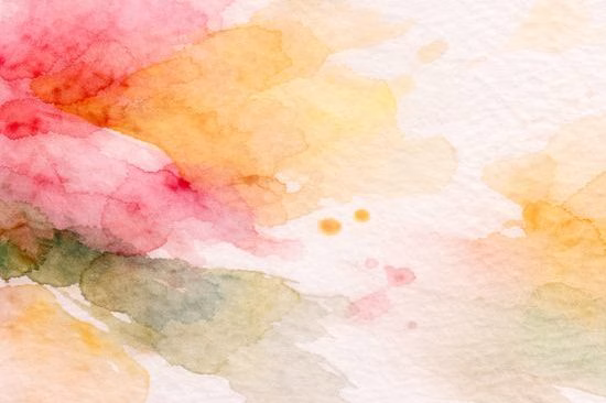
(Featured image: Close-up landscape view of watercolour paint bleeding into textured paper with soft blended edges in pink, yellow, and green tones. Photo by VanVakarnee)
Unlike acrylics or oils, which cover the surface entirely, watercolor interacts with light. It doesn’t just reflect light; it seems to hold it.
If your space feels small, dark, or cluttered with heavy furniture, watercolor art acts as a visual window, tricking the brain into perceiving more depth and airiness than actually exists.
As we move away from the stark sterility of “ultra-minimalism,” we are seeing a shift toward “warm minimalism”—spaces that are uncluttered but rich in texture and organic form.
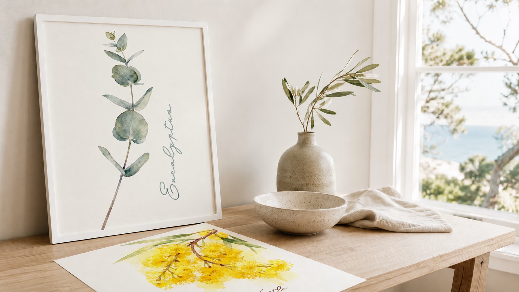
Forget the dusty, scientific illustrations of the Victorian era. The new wave of botanical watercolor art focuses on movement and imperfection. We are seeing lush ferns, eucalyptus stems, and wildflowers painted with loose, gestural strokes.
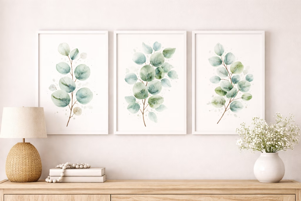
(Featured image: Set of 3 botanical watercolor art prints featuring eucalyptus leaves framed in white for modern farmhouse wall decor. Photo by VanVakarnee)
Abstract watercolor painting prints are dominating the market because they prioritize color psychology over subject matter. These pieces often feature “color washes” large swathes of Ombré pigment that transition from deep indigo to barely-there mist.
Nursery wall art has graduated from cartoonish vectors to sophisticated watercolors. Parents are choosing art that can transition as the child grows baby animals rendered in realistic but soft anatomical styles, or celestial moon phases.
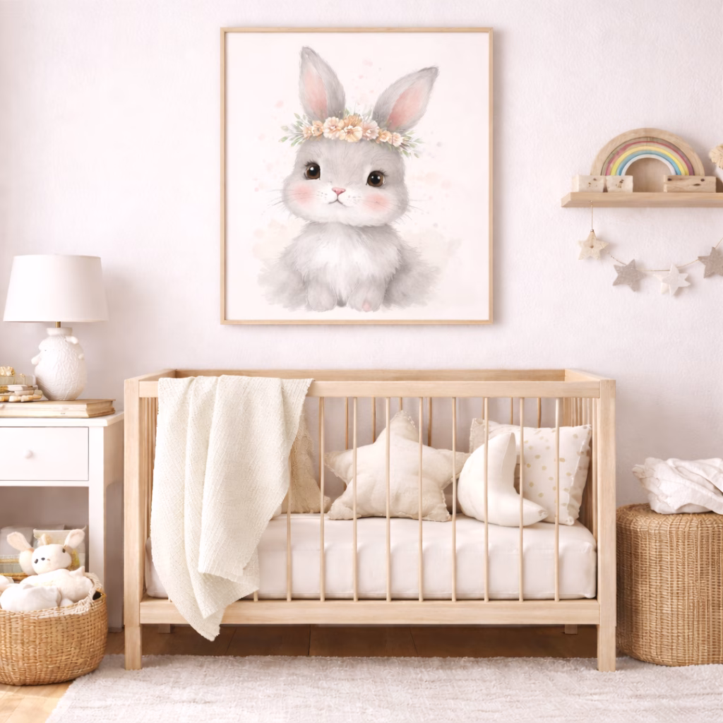
(Featured image: Whimsical nursery wall art watercolor painting of a baby bunny with soft grey tones in a crib room. Photo by VanVakarnee)
This is the “window effect.” Coastal watercolors differ from photography because they capture the feeling of the ocean rather than the literal waves. They strip away the details (people, umbrellas) and leave only the palette: sand, sea, and sky.
This is where most homeowners get duped. Not all prints are created equal. A $10 print from a big-box store will look vastly different from a $100 print from an art house, and the difference lies in the chemistry.
If the product description says “poster paper” or “cardstock,” walk away. Authentic watercolor wall prints must be printed on paper that mimics the original substrate.
“Giclée” (pronounced zhee-clay) is not just a fancy word for “inkjet.” To qualify as a Giclée print, three criteria must be met:
Because watercolor is delicate in visual weight, it requires specific framing strategies to ensure it doesn’t get lost on the wall.
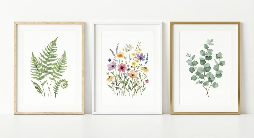
(Featured image: Set of three framed watercolour botanical prints featuring fern leaves, wildflowers, and eucalyptus, styled in light oak, white, and gold frames on a neutral wall for modern farmhouse décor. Photo by VanVakarnee)
The frame should act as a container, not a distraction.
Never put a watercolor print directly against the glass (unless it is floated). More importantly, do not frame it without a mat (mount).
The modern art market offers two paths: buying the physical print or buying the digital file.
Digital Downloads
Shipped Physical Prints
Can you hang watercolor prints in a bathroom? Technically, yes, but with caveats. Humidity is the enemy of paper art. If you want the spa-like vibe of watercolor in a bathroom, ensure the room has excellent ventilation (an extractor fan is a must). The frame must be professionally sealed at the back, and you should swap standard glass for acrylic (Plexiglass), which is less prone to condensation buildup.
Does watercolor art fade? All art reacts to light, but watercolor is historically notorious for fading. However, modern Giclée prints using pigment inks are rated to last 100+ years without significant fading if kept out of direct, scorching sunlight. Always use UV-protective glazing if the print faces a sunny window.
How do I choose the right size for my print? A common mistake is going too small. The “soft” nature of watercolor means it can look insignificant if it’s too tiny.
We live in an era of “fast furniture” and algorithmic design. Your home should not look like a catalogue page; it should look like you. Watercolor wall prints offer a bridge between the high-brow world of fine art and the accessible comfort of home decor.
They bring a fluidity that rigid modern architecture lacks. Whether you choose a moody abstract watercolor painting to center your thoughts or a vibrant botanical piece to bring the garden inside, the goal is the same: to create a space that feels soft, breathable, and intentionally curated.
Don’t just fill the wall. Frame a feeling.