
How to Choose Tasmanian Wall Art Prints That Feel Calm, Not Busy
Bedroom art has a harder job than most rooms ask of a print – low light, strong morning sun, and years of small daily…
By Wattson B.
May 4, 2026 | 10:00 AM AEST
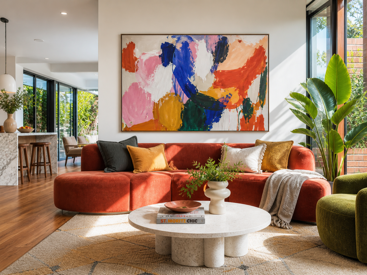
(Featured image: Large colourful abstract wall art print above a rust sofa in a bright modern Australian living room Photo by VanVakarnee.)
Choosing abstract art should feel exciting. Instead, it often creates one very specific worry:
Will this just look like a chaotic blob on my wall?
It is a fair question. Abstract wall art prints are one of the most popular choices for modern homes, but they are also one of the easiest categories to second-guess. Unlike a coastal photograph, botanical print, or landscape scene, abstract art does not tell you exactly what you are looking at. It works through colour, shape, movement, texture, and mood.
That freedom is the whole appeal. A good abstract print can make a room feel calmer, warmer, bolder, softer, more expensive, or more resolved without locking the space into one obvious theme.
The trick is not to “understand” abstract art in an academic way. The trick is to choose a piece that suits the room.
Abstract art uses colour, line, shape, texture, and composition instead of literal subjects like beaches, trees, animals, or buildings.
That is the simple version.
In home styling, this matters because abstract art is flexible. It can echo the tones already in your sofa, rug, timber floors, cushions, or bedding without repeating the same obvious subject matter. It can soften a practical room, give an open-plan living area a focal point, or add structure to a blank wall that currently feels unfinished.
For Australian homes, especially newer builds and apartments with open-plan layouts, abstract prints are useful because they can connect different zones without making the room feel themed. A warm neutral abstract can sit comfortably between a kitchen, dining area, and living room. A bold geometric piece can bring order to a hallway. A soft watercolour-style abstract can quieten a bedroom without looking plain.
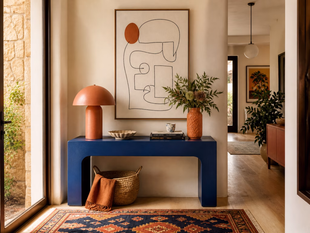
(Image: Minimalist line work abstract wall art print above a blue console in a warm modern entryway. Photo by VanVakarnee.)
Not all abstract art behaves the same way in a room. Some pieces feel energetic and expressive. Others feel quiet, architectural, or almost meditative. Before choosing a print, it helps to know which kind of abstract you are actually drawn to.
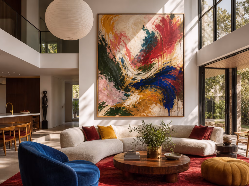
Gestural abstracts are built around visible movement. You might see sweeping brush marks, layered strokes, strong curves, or marks that feel quick and expressive.
These suit rooms that need energy. A living room with a plain linen sofa, a simple rug, and warm timber flooring can handle a gestural piece because the artwork brings life to an otherwise restrained setting. It works especially well when the colours are controlled, even if the movement is bold.
The mood is expressive, confident, and slightly artistic without feeling formal.
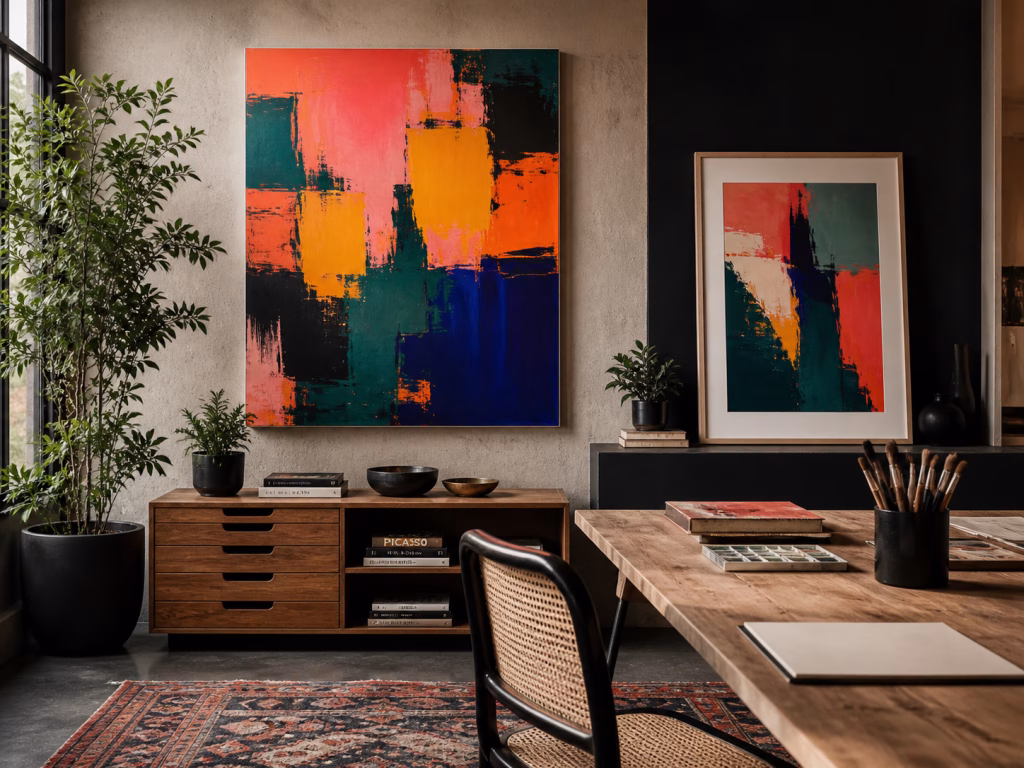
Geometric abstracts use clear shapes, blocks, lines, grids, circles, arches, or repeated forms. They usually feel more structured than brushstroke pieces.
These work well in modern apartments, home offices, dining rooms, and hallways because they bring order to the wall. If your room already has clean furniture lines, black accents, architectural lighting, or a modern timber dining table, a geometric print can make the space feel sharper and more intentional.
The mood is clean, modern, organised, and graphic.
Colour field abstracts are usually about large areas of colour rather than detailed marks. They may be soft and tonal or bold and saturated, but the feeling comes from the relationship between colour blocks.
These are strong choices for larger walls because they can create atmosphere without too much visual noise. A soft beige, ochre, blue-grey, or muted green colour field print can work beautifully in a living room with large windows and strong afternoon light.
The mood is calm, immersive, and spacious.
Minimalist abstract prints rely on simple lines, negative space, and restraint. They often suit smaller rooms because they add interest without crowding the wall.
This style works well in bedrooms, entryways, studies, and apartments where the furniture is already doing some of the visual work. A black line abstract in a white or oak frame can sit neatly above a console, bedside table, or reading chair without overpowering the space.
The mood is quiet, refined, and uncluttered.
Watercolour-style abstracts have softer edges, gentle colour bleeding, and a lighter, more atmospheric quality. They are ideal when you want the wall to feel finished but not heavy.
These pieces suit bedrooms, nurseries, relaxed living rooms, coastal homes, and interiors built around linen, pale timber, cream walls, and soft natural textures. They can also work beautifully in Australian homes where the light is strong, because the softness of the artwork helps balance glare and hard surfaces.
The mood is relaxed, gentle, airy, and calming.
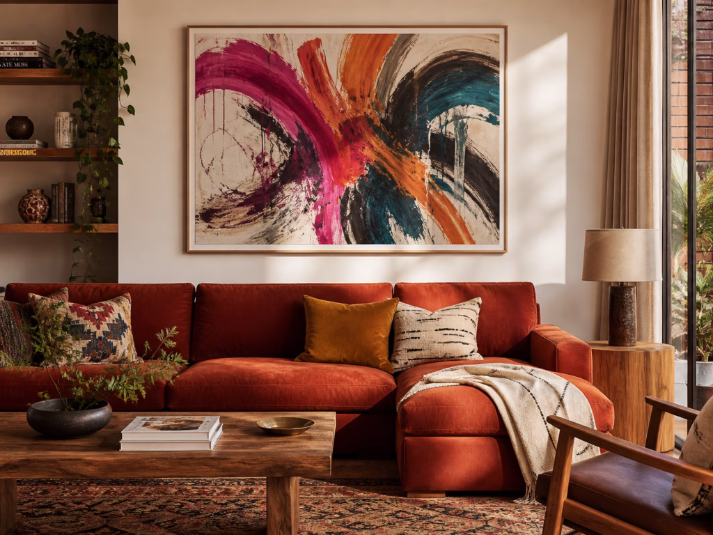
(Image: Gestural abstract wall art print with magenta, orange and teal brushstrokes above a terracotta sofa Photo by VanVakarnee.)
The easiest way to choose abstract wall art is to stop starting with the artwork.
Start with the room.
Look at the largest visual elements first: the sofa, bedhead, rug, curtains, flooring, dining table, cabinetry, or feature chair. These pieces already control the palette. Your art should echo them, not compete with them.
If you have a neutral linen sofa, look for abstract prints with cream, taupe, beige, soft grey, sand, muted olive, or clay tones. If your room has warm timber floors, art with ochre, rust, caramel, brown, muted orange, or warm off-white can feel naturally connected. If your bedroom has blue-grey bedding, a cooler abstract with slate, mist, navy, or pale blue can help the room feel settled.
The goal is not an exact match. Matching every cushion, throw, and artwork too perfectly can make a room feel staged. A better approach is to repeat two or three tones from the room and then allow the artwork to introduce one small contrast.
For example, a beige living room with warm timber floors might suit an abstract print with cream, tan, charcoal, and a small touch of deep green. The cream and tan connect to the room. The charcoal gives structure. The green adds life.
Design Note: If the room already has a lot of movement, such as patterned rugs, veined stone, timber grain, open shelving, or many small decorative objects, choose a calmer abstract. If the room is very plain, you can choose a piece with more movement.
Abstract art has rhythm. Some pieces feel slow and horizontal. Some feel sharp and angular. Some feel circular, layered, or restless.
A room has rhythm too.
A low modular sofa, long coffee table, and wide rug create a horizontal rhythm. A tall hallway, narrow console, and vertical windows create a vertical rhythm. A dining room with repeated chairs, pendant lights, and table legs already has a sense of repetition.
The artwork should either support that rhythm or deliberately break it.
Above a long sofa, a wide abstract print usually feels more natural than a narrow portrait piece. In a hallway, vertical abstract prints often work well because they create upward movement without making the corridor feel longer. In a dining room, a centred piece above the table can help anchor the setting, especially in open-plan homes where the dining zone needs its own identity.
This is where abstract art is especially useful in Australian interiors. Many newer homes have large open living spaces, kitchen-dining zones, wide sliding doors, and big windows. Without a strong artwork, these rooms can feel like one large blank box. A well-sized abstract print gives the eye somewhere to land.
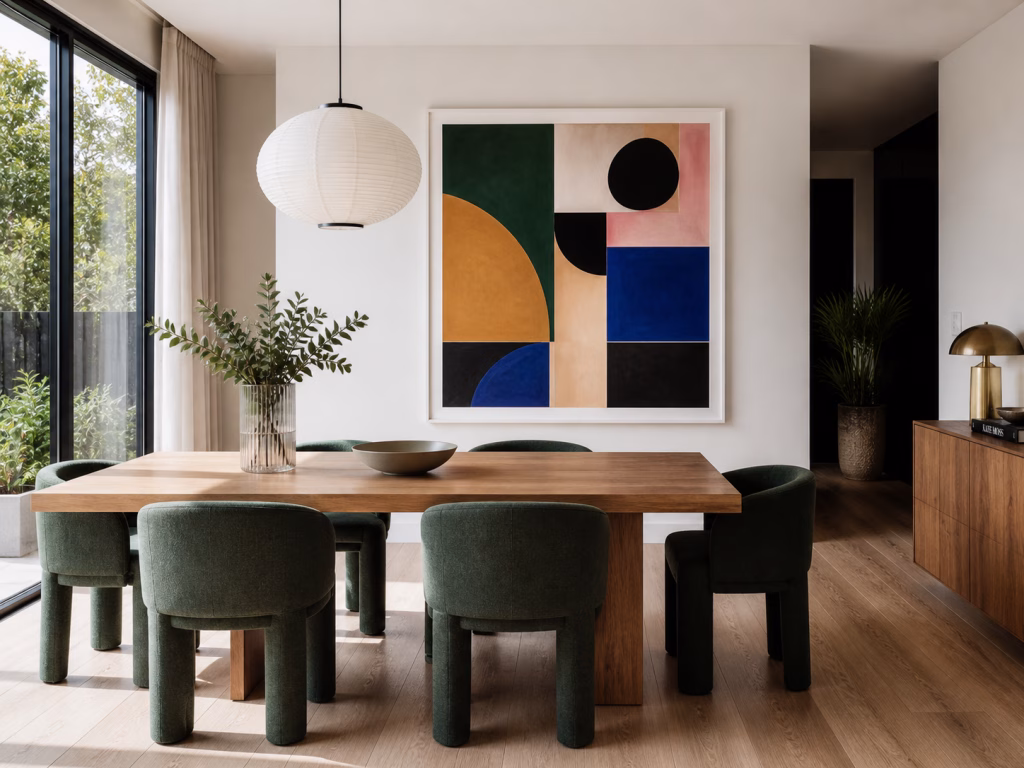
(Image: Geometric abstract wall art print in a modern dining room with timber table and green chairs lit by soft natural light from wide windows. Photo by VanVakarnee.)
Most wall art mistakes are not really style mistakes. They are size mistakes.
A beautiful print can look weak if it is too small for the wall. This is especially true with abstract art because abstract pieces often need enough scale for the movement, colour, and composition to make sense.
As a general rule, choose artwork that fills roughly two-thirds of the sofa width. It does not need to cover the entire sofa, but it should feel visually connected to the furniture beneath it.
If the piece is too small, it will float. If it is too wide, it can make the sofa feel cramped.
Use a similar rule above a bed. The artwork should relate to the width of the bedhead and feel calm enough for a restful space.
Soft abstracts, muted colour fields, watercolour-influenced pieces, and minimalist line work are usually safer here than very high-energy brushstroke pieces.
In hallways, vertical orientation often works well because people view the artwork while moving past it. A portrait-format abstract can lift the eye and make the wall feel styled without taking up physical space.
For very long hallways, consider a sequence of two or three related prints rather than one tiny piece sitting alone.
In a dining room, centre the artwork over the table or sideboard rather than the wall as a whole. The furniture is the anchor. The art should belong to that setting.
A geometric or colour field abstract can work especially well in dining rooms because it creates structure without distracting from conversation, lighting, or table styling.
An entryway needs a quick read. Choose a piece with clear colour and shape rather than something overly detailed. A strong abstract print above a console table can make the home feel considered from the moment someone walks in.
Pro Tip: Before ordering, use painter’s tape to mark the artwork size on the wall. Stand back, sit down, and walk past it. If the taped outline feels too small, the final artwork will probably feel too small too.
The finish changes how abstract art feels.
Canvas gives abstract art texture and presence. It suits larger pieces, relaxed interiors, soft neutral rooms, and spaces where you want the print to feel like a finished object rather than a flat poster. Wall art canvas prints can be especially effective for gestural abstracts, colour field pieces, and earthy neutral compositions because the texture helps soften the artwork.
Framed paper prints feel cleaner, sharper, and more gallery-like. They suit minimalist line work, geometric abstracts, smaller prints, gallery walls, and modern apartments where the frame is part of the design.
For frame colour, the safest options are usually oak, black, and white.
Oak or natural timber works well with warm timber floors, linen sofas, coastal interiors, and Australian homes with a relaxed natural palette. Black frames add contrast and structure, especially around geometric or monochrome abstracts. White frames create a lighter gallery feel and suit soft, minimal, or pale-toned rooms.
There is no single correct choice. Canvas is stronger when you want softness, scale, and texture. Framed paper is stronger when you want crisp lines, clean edges, and a more polished gallery finish.
(Image: The same abstract artwork shown two ways: as a textured canvas print and as a framed paper print in oak, black, and white frame options. Photo by VanVakarnee.)
Australian homes often have strong natural light, especially in living rooms with large windows, sliding doors, pale walls, and open-plan layouts. That light can make a room feel beautiful, but it can also change how artwork reads.
In a bright room, very glossy surfaces can show reflections. A canvas print or a framed print placed away from direct glare may be easier to live with. In rooms with warm afternoon light, earthy abstracts can look especially good because ochre, clay, sand, cream, and olive tones become richer as the light changes.
If your room faces harsh sun, avoid choosing a print only from a small thumbnail. Look at the full composition and imagine how it will behave when light hits the wall. A piece with a balanced palette and clear structure will usually hold up better than one that relies on very subtle detail.
Design Note: In bright living rooms, abstract art can also help balance hard materials. If the space has tiles, glass, stone benchtops, white cabinetry, or metal finishes, a textured canvas or soft abstract print can make the room feel less sharp.
Abstract art is forgiving, but it is not random. The wrong piece can make a room feel busier, smaller, or less resolved.
A thumbnail tells you colour. It does not tell you scale, wall presence, or how the piece sits with furniture.
Always look for a styled room mockup or imagine the print in relation to a sofa, bed, console, or dining table. Abstract art changes dramatically once it has space around it.
This is the biggest mistake. Small abstract prints can work beautifully in a gallery wall, on a shelf, or above a bedside table. But on a large blank wall, one small abstract print often looks accidental.
If you want the artwork to anchor the room, choose a size that has enough presence.
Some rooms need calm. Some rooms need contrast. Some rooms need warmth. Some rooms need structure.
If your room already has busy patterns, choose a quieter abstract. If your room is very minimal, choose something with stronger movement or colour. If your room is warm and earthy, avoid a piece that feels icy unless you deliberately want contrast.
The artwork should improve the room’s rhythm, not interrupt it.
If you are unsure, start with three questions.
What is the largest piece of furniture near the wall?
What colours already dominate the room?
Do you want the artwork to calm the space, sharpen it, or make it feel warmer?
Those answers will usually narrow the choice quickly.
For a neutral living room, start with soft abstract wall art prints in cream, beige, taupe, clay, olive, or charcoal. For a modern apartment, look at geometric or minimalist abstracts with clean lines. For a relaxed bedroom, try watercolour-influenced abstracts or gentle colour field pieces. For a large open-plan space, choose a piece with enough scale to create a real focal point.
Abstract art does not need to be confusing. It just needs to belong to the room.
Browse the VanVakarnee Abstract Art collection for abstract wall art Australia options designed to sit naturally in modern homes. If your wall needs more scale and presence, explore Statement Pieces for larger artwork that can anchor a living room, dining space, hallway, or bedroom.
(Image: A completed modern Australian living room with a large abstract wall art print above a neutral sofa, styled with warm timber floors, linen cushions, a textured rug, and afternoon light through large windows. Photo by VanVakarnee.)
