
How to Choose Tasmanian Wall Art Prints That Feel Calm, Not Busy
Bedroom art has a harder job than most rooms ask of a print – low light, strong morning sun, and years of small daily…
By Anne N.
May 5, 2026 | 10:00 AM AEST
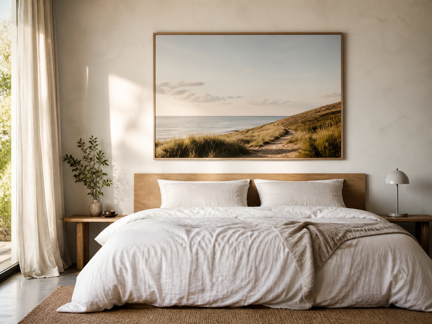
(Featured image: Large bedroom wall art print hung above a low timber bedhead with white linen, two pillows, and soft morning light across the wall. Photo by VanVakarnee)
Do your bedroom wall art prints add to the noise, or bring you calm?
You wake up and the first thing your eyes land on is the wall above your bed. The print you chose six months ago — the one that looked great on a thumbnail — feels too busy in the morning light. It’s pulling your attention before you’ve even sat up.
Bedroom wall art prints have a harder job than most rooms ask of a print. You see them half-conscious, in low bedside light, in strong morning sun, and across years of small daily moments. Pieces that hold a living room together — bold colour, sharp contrast, or a single dramatic image — can turn a bedroom restless.
Subject, size, finish, frame, and placement all read differently in here. So what should you be looking for?
Before you start browsing, sit on the bed and answer three things.
Do I want this room to feel grounded and still, or do I want something that lifts me a little when I walk in? Both are fair answers. They point to different kinds of art.
Will this piece complement how the room already feels, or fight with it? Most bedrooms have a mood already set by the bedlinen, the floor, the wall colour, and the way light moves through the day. A print works best when it agrees with that mood.
Could I happily look at this every morning for the next two years? If the answer needs caveats, keep looking.
Most bedroom art mistakes come from one thing: a piece that pulls focus when the room needs the opposite. The five categories below pull focus less than most. They aren’t the only options, but they’re the ones least likely to wake you up before you want to be awake.
| Subject | Why it works in a bedroom | What to watch for |
|---|---|---|
| Soft tonal landscapes | The eye glides across distant mountains, mist-softened bushland, or calm coastlines rather than landing on a single point | Skip dramatic skies and storm scenes |
| Restrained photography | Single focal points and soft natural light hold up well in bedrooms because they feel observed rather than staged | Avoid heavily edited or high-contrast images |
| Watercolour-influenced abstracts | Soft edges and tonal washes layer beautifully with linen, timber, and warm-neutral palettes | Hard-edged geometric abstracts can read busy |
| Muted botanical prints | Single specimens, foliage studies, and dried flowers feel restful in early morning light | Bright greens and saturated florals can feel jarring |
| Black and white photography | Reliable in almost any bedroom palette, and one of the most forgiving choices if you’re unsure | Heavily contrasted graphic prints can fight the room |
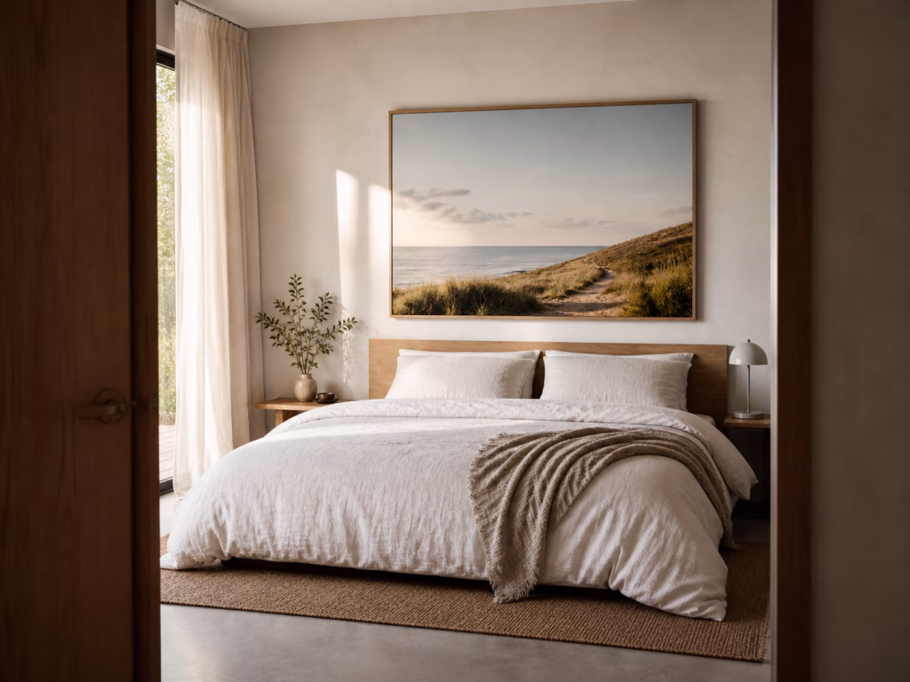
(Image: Bedroom viewed from the doorway with a single large wall art print above the bed, showing how the artwork sits in the room before the viewer steps inside. Photo by VanVakarnee)
Photography suits bedrooms when it gives the eye somewhere gentle to rest. The best bedroom photo prints usually have space inside them: open sky, quiet water, soft shadows, distant land, or a single subject with room around it.
A bedroom is not always the right place for a photograph that tells too much of a story. Street scenes, crowded compositions, sharp architecture, and dramatic portraits can be brilliant in a hallway or living room, but above a bed they often ask for more attention than the room should demand.
Look for photographs that feel still without feeling empty.
| Photo style | Why it works | Best placement |
|---|---|---|
| Misty landscapes | Soft depth makes the room feel quieter and larger | Above the bed or opposite the bed |
| Calm coastal photography | Water, horizon lines, and pale sand bring a natural sense of ease | Above a bed, dresser, or reading chair |
| Soft botanical photography | Works well with linen, timber, and warm neutral rooms | Beside the bed or above a low cabinet |
| Minimal black and white photography | Adds structure without adding colour noise | Above darker bedheads or in monochrome rooms |
| Distant architectural details | Gives a room shape and rhythm without feeling too personal | Best in larger bedrooms or guest rooms |
The easiest test is distance. Stand at the bedroom doorway and glance at the photo for two seconds. If your eye relaxes into it, it probably belongs in the room. If your eye starts decoding faces, signs, hard lines, or small details, it may be better somewhere else.
Some art is brilliant. It just isn’t bedroom art. The categories below are worth saving for other rooms.
High-contrast pop art and graphic prints demand attention you don’t want them to demand. Save them for living rooms or studies.
Busy gallery wall arrangements work in hallways and lounges. Above a bed, they feel cluttered at the worst time of day to feel cluttered.
Highly saturated colour schemes fight with how the room reads in low light. A piece that looks vibrant under shop lighting can feel almost neon at dusk.
Oversized portraits, faces, or close-up eyes can be unsettling above a bed. Many people can’t sleep with them in view.
Religious or symbolic imagery is worth choosing only when it carries personal meaning. In any other space, it can feel borrowed.
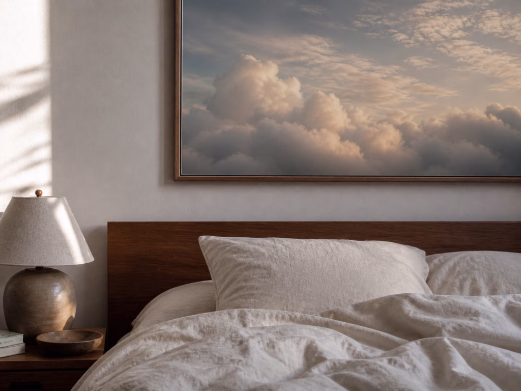
(Image: Close-up of a wall art print above rumpled linen sheets, with the lower edge of the artwork, bedhead, and bedside lamp visible for scale. Photo by VanVakarnee)
Sizing is the part most people get wrong, so it’s worth being specific.
The two-thirds rule is the easiest place to start. A single piece of art above a bed should be roughly two-thirds the width of the bedhead. Smaller than that and it floats. Larger than that and it crowds the wall.
| Bed | Bed width | Recommended print width |
|---|---|---|
| King | 1.83m | 1.10m – 1.20m, usually a 36×48 inch print |
| Queen | 1.52m | 0.95m – 1.05m, usually a 30×40 inch print |
| Double | 1.37m | 0.85m – 0.95m, usually a 24×36 inch print |
| King Single | 1.07m | 0.65m – 0.75m, usually A1 or 24×36 inch depending on the room |
These are starting points, not laws. A bedroom with high ceilings can often carry a slightly larger print. A small room with low ceilings may feel calmer with something a little narrower.
The bottom of the frame should sit roughly 15 to 25 cm above the bedhead. Closer than 15 cm and the piece feels cramped on the bed. Higher than 25 cm and it visually disconnects from the bed below.
If the room has high ceilings or an unusually tall bedhead, lean towards the upper end of that range. If the ceiling is standard and the bedhead is low, the lower end usually works better.
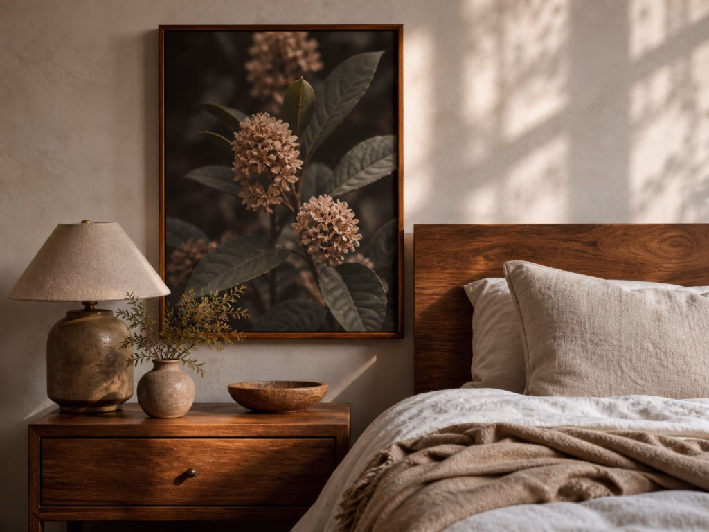
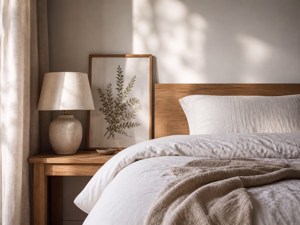
(Image: Botanical wall art print styled beside a timber bedside table, ceramic lamp, linen pillow, and folded throw. Photo by VanVakarnee)
Landscape orientation is usually the safest choice above a bed. It follows the width of the bedhead and helps the room feel settled.
Portrait prints can work beautifully, but they need breathing room. They are often better in pairs, above bedside tables, or on a narrow wall beside a wardrobe or dresser.
Square prints sit somewhere in the middle. A large square piece can feel calm and balanced above a queen or king bed, especially if the image itself is simple. A small square print above a wide bed usually feels lost.
The number of pieces you hang above the bed changes the feel of the room more than people expect.
| Configuration | When it works | What to watch for |
|---|---|---|
| Single piece | Tonal or minimalist bedrooms, and any room where you’re unsure what to choose | Hardest to get wrong, easiest to live with |
| A pair | Above a queen or king bed with matching bedside lamps below | Placed right, it can frame the bed visually without feeling formal |
| Triptych | When all three pieces are tonally consistent and read as one composition | If they aren’t consistent, the wall looks like a corridor of separate ideas |
| Gallery wall | Living rooms and hallways | Avoid above a bed if you want the room to feel quiet |
Bedrooms have two light problems most other rooms don’t. Bedside lamps throw light directly across the wall behind the bed, and daylight can hit the bed wall strongly depending on the room’s orientation. East-facing rooms often catch morning sun. North-facing rooms in Australia can receive strong seasonal daylight. Both can turn a glossy print into a mirror.
Choose canvas finishes for bedroom prints over high-gloss paper. Canvas scatters light gently rather than reflecting it back into the room. Since our prints arrive unframed, if you choose to frame a paper piece, ask your local framer about non-reflective glazing — the glass or acrylic in front of the print. It costs a little more, and it’s worth it for the wall above a bed.
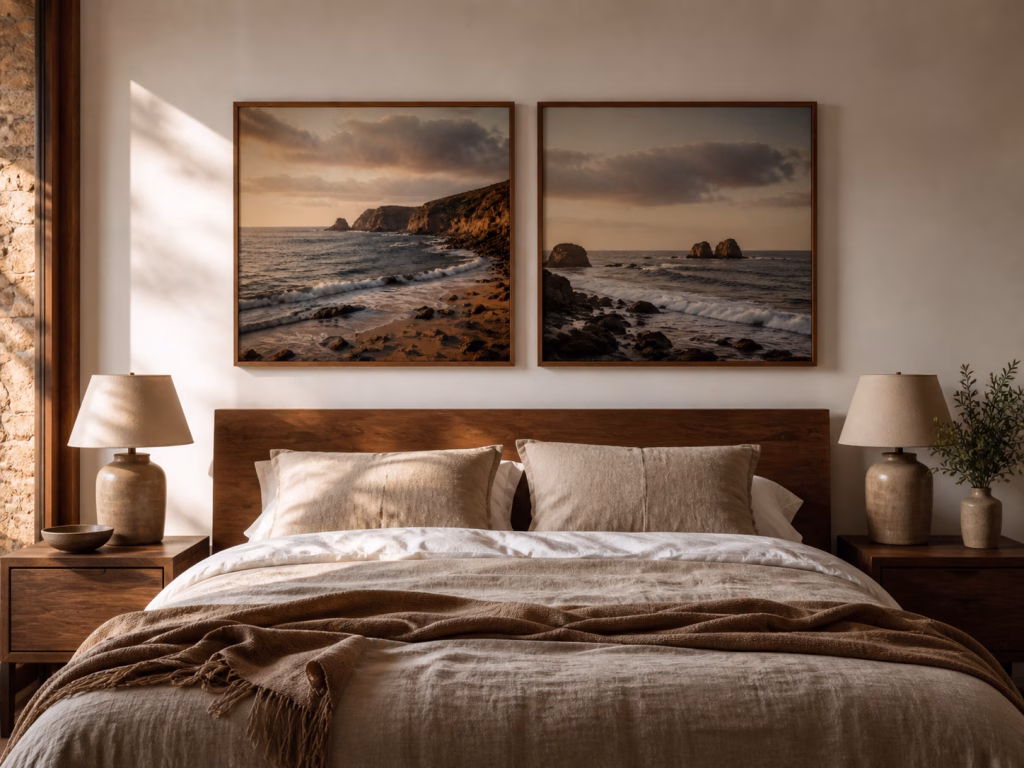
(Image: Two matching bedroom wall art prints hung evenly above a queen bed, with each print aligned over one half of the bedhead. Photo by VanVakarnee)
While Van Vakarnee supplies prints unframed so you can source the perfect match locally, the frame you choose should disappear into the room rather than compete with the art.
| Frame finish | Best for | Notes |
|---|---|---|
| Oak or natural timber | Warm, tonal, layered interiors | Suits Australian bedrooms with timber floors or warm-neutral walls |
| Black | Contemporary or monochrome bedrooms | Strong pairing with black and white photography |
| White | Coastal, Scandinavian, or airy bedrooms | Disappears against pale walls and lets the image carry the room |
| Unframed paper print | Renters and lighter spaces where a frame would feel heavy | Use a poster rail or magnetic hanging system, especially in rentals where wall damage matters |
(Image: Oak-framed bedroom wall art print leaned against wall beside a timber bedhead with warm bedding and a ceramic bedside lamp. Photo by VanVakarnee)
If everything above feels like a lot, choosing art for above the bed comes down to five steps.
Decide the mood you want the room to carry.
Choose a subject that suits a bedroom, not just a subject you like in isolation.
Size it against the bed beneath it using the two-thirds rule.
Match the finish to the light. Canvas handles bedroom light well, while framed paper prints benefit from non-reflective glazing.
Pick a frame locally that disappears into the room.
Five things, five useful rules. Easy to remember, and enough to help you choose bedroom wall art that feels calm, considered, and easy to live with.
A single piece above a bed should be roughly two-thirds the width of the bedhead. For a king bed (1.83m wide), that’s a print around 1.10m to 1.20m – typically a 36×48 inch print. For a queen, look at 30×40 inch; for a double, 24×36 inch. Smaller pieces tend to float on the wall; larger ones crowd it.
The bottom of the frame should sit roughly 15 to 25 cm above the bedhead. Closer than 15 cm feels cramped on the bed. Higher than 25 cm visually disconnects the piece from the bed below.
Canvas is usually the better choice for a bedroom. It scatters light gently rather than reflecting it, which matters when bedside lamps and morning sun hit the wall directly. High-gloss paper can act like a mirror in those conditions.
The most calming bedroom prints share a few things: soft tonal landscapes, restrained photography, watercolour-influenced abstracts, muted botanicals, or black and white photography. The eye moves across them rather than catching on a single point of detail.
Generally, no. Gallery walls suit hallways and living rooms, where busy compositions feel right. Above a bed they tend to feel cluttered at the time of day you most want quiet.
Aim for tones that sit comfortably with the bedlinen and the wall colour. A print that picks up one or two of the room’s existing tones usually works better than one that mirrors the whole palette, and far better than one that ignores it.
For most people, yes. Oversized portraits, faces, or close-up eyes can feel unsettling above a bed, and many people find them difficult to sleep under. Save them for living rooms, hallways, or studies
If you want a place to start, the Van Vakarnee bedroom collection is built around the same approach – calm palettes, sizes that match standard Australian beds, and finishes that hold up to morning light.
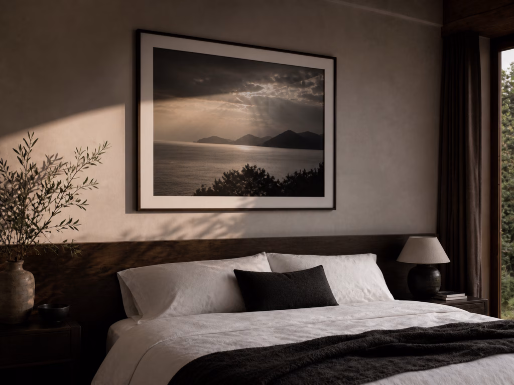
(Image: Black-framed bedroom photography print above a simple bed setting, styled with dark accents and white linen. Photo by VanVakarnee)
