
Living room art guide · Monochrome edition
When black and white prints work better than colour
Your living room already has its colours. A monochrome print gives the wall presence without adding another voice.
Shop black & white prints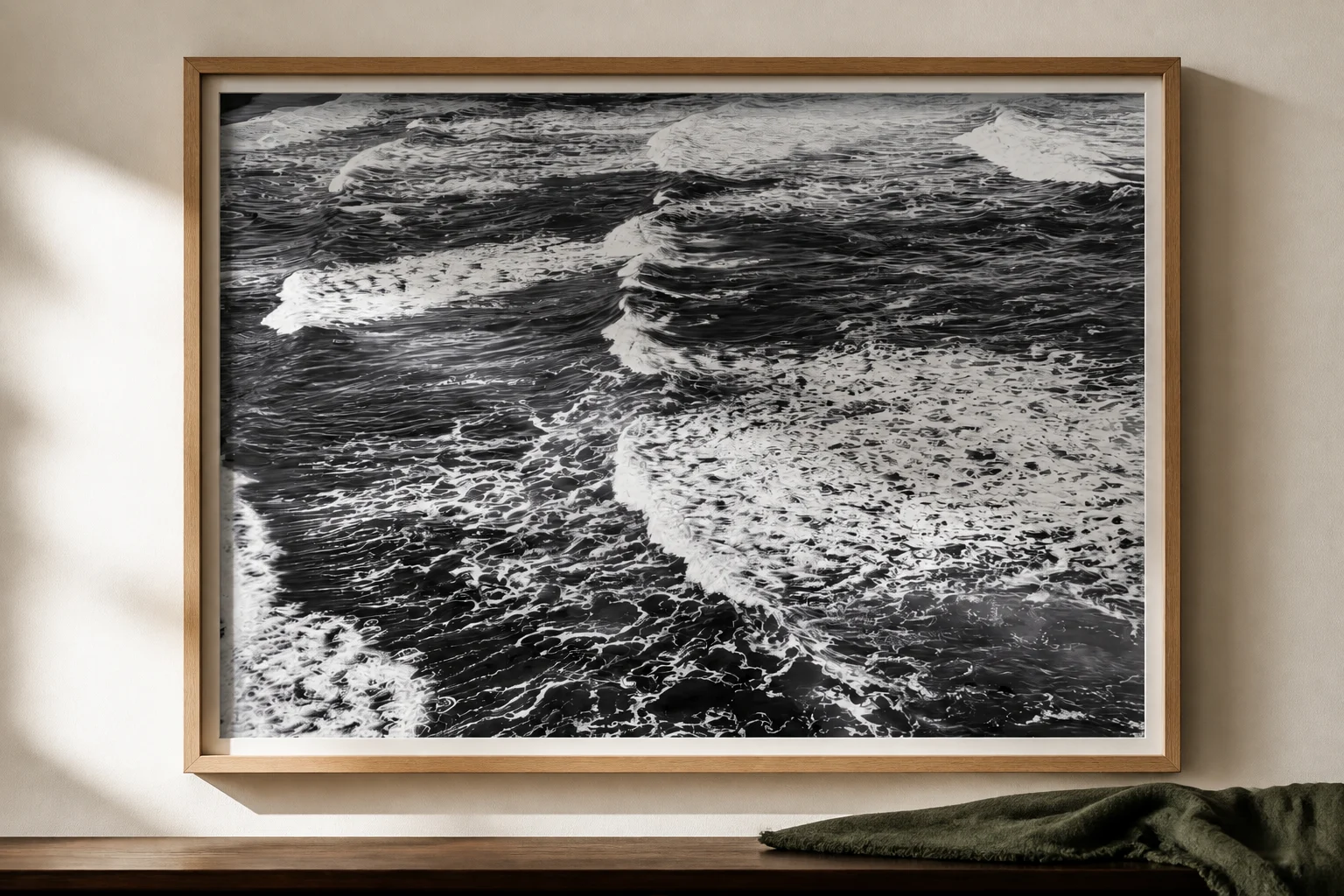
The rug is doing a lot. The cushions carry three colours between them, the floor is warm timber, and the window pulls the garden in. Every print you shortlist online seems to add one more colour to a room that has committed to plenty. That is the situation black and white prints for living rooms are built for. A monochrome print earns its place through light, shadow, and composition, without asking the rest of the room to make space for a new palette.
Why does black and white art settle some rooms and fight others?
A black and white print removes one variable from the room. Colour is the element most likely to clash, date, or compete, and a monochrome image takes it off the table. What remains is tone: the range from deep black through every grey to bright white. Tone gives a wall contrast and depth without adding a colour decision, so the print can hold its position without joining the argument the cushions are having with the rug.
The same quality can work against you. In a sparse room with a cool palette, a monochrome print can read as stark rather than calm. There is nothing for its restraint to balance. Black and white settles rooms that have colour to spare. It can drain rooms that have none. Knowing which of those two rooms you own is most of the decision, and the rest of the article works through it.
Black and white settles rooms that have colour to spare. It can drain rooms that have none.
Which rooms suit black and white prints best?
Living rooms with a committed palette are the clearest case. If the sofa, rug, and shelves have decided the colour story, black and white prints for a living room give the wall presence without casting a new vote. Timber-heavy rooms are close behind. Monochrome sits well against oak, blackbutt, and spotted gum, because the timber supplies the warmth the print holds back.
Hallways reward strong tonal contrast. You see hallway art at an angle and in passing, and a high-contrast monochrome image stays legible where a soft colour print blurs into the wall. Home offices are the quiet fourth: a black and white print behind your desk reads well on video calls without pulling focus from you.
Australian light matters here. Strong afternoon sun flattens weak colour prints, but it favours confident tonal contrast. A monochrome image with proper blacks holds its own in a bright room long after a pastel print has washed out.
Where monochrome earns its place
Room
Why monochrome works
Watch out for
Living room with colour committed
Adds presence without a new colour vote
Low-contrast images disappearing against busy walls
Timber-heavy rooms
Timber warmth balances monochrome restraint
Frames that clash with the floor tone
Hallways
High contrast stays legible at an angle
Gloss glare under downlights
Home office
Reads well on camera and does not pull focus
Busy compositions directly behind your head
When does a colour print do the job better?
Some rooms need what colour does, and no styling argument changes that. An all-white or grey minimalist room usually needs warmth, and a black and white print adds contrast without adding any. In that room, a print with warm tones is doing structural work the monochrome option cannot.
The second case is the room where the art carries the whole visual load. If the walls are plain and the furniture neutral, the print is the only interest in the room. A colour image gives it more to work with.
The third case is preference, and it is a legitimate one. Some buyers want the print to be the colour moment in the room. If that is the brief, buy the colour print. A monochrome image bought against your own instinct will feel like a compromise every time you sit down.
What’s the difference between photographic and graphic black and white prints?
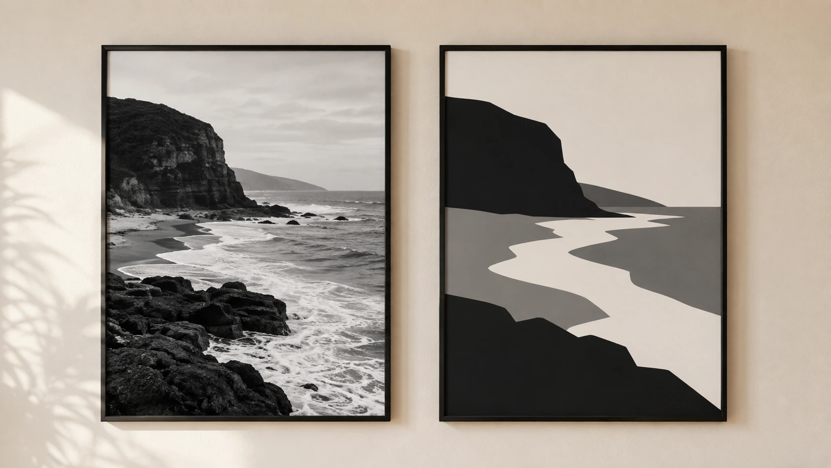
Photographic and graphic black and white are different products that share a palette. A photographic monochrome print carries a full tonal range: deep blacks, bright whites, and hundreds of greys between them. That range creates depth, texture, and the sense that you could walk into the image. A graphic or vector print usually works in two or three flat tones. It reads as shape and pattern, and it stays flat by design.
Neither is wrong, but they behave differently on a wall. A photographic print changes as you move. From across the room it reads as a strong composition. Up close, the texture of water, bark, or cloud appears. A flat graphic print looks the same at every distance. If you want the wall to reward a second look, tonal range is what delivers it.
The conversion matters as much as the capture. Turning a colour photograph into monochrome means deciding which colours become which greys, and that decision separates a photograph converted with care from a filter applied in one click. A sky and a sea that sat apart in colour can collapse into the same grey if the conversion is lazy.
What size should a black and white print be?
The furniture-width rule covers most walls: aim for a print, or a group of prints, about two-thirds the width of the furniture below it. A 2.1 m sofa wants roughly 140 cm of art above it. A queen bed at 153 cm wide wants about 100 cm. Hang the print so its centre sits near eye level, roughly 145–150 cm from the floor, or 15–25 cm above a bedhead or sofa back. For more room-by-room measurements, keep the Van Vakarnee wall art sizing cheat sheet nearby.
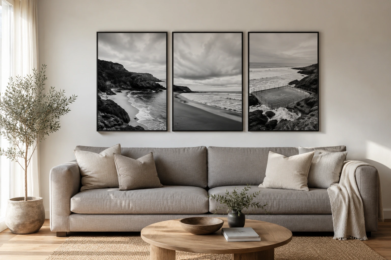
The largest single print in the range is 36x48 inch, which is 91 x 122 cm. For a sofa longer than about 2.2 m, one print cannot reach two-thirds width on its own. A pair or triptych can, and monochrome makes that easier than colour does.
Size mapping for common Australian walls
Wall
Aim for
Size that fits
A-size option
Sofa up to 2 m
120 cm+ wide
36x48 inch landscape, 91 x 122 cm
Pair of A1, hung portrait
Sofa over 2.2 m
140 cm+ wide
Pair of 24x36 inch or a triptych
Triptych of A1
Queen bed
About 100 cm wide
30x40 inch landscape, 76 x 102 cm
A1, 59 x 84 cm
Hallway
40–60 cm wide, portrait
24x36 inch, 61 x 91 cm
A2, 42 x 59 cm
One print, a pair, or a triptych?
Triptych, in plain English: three separate prints hung together as one composition. (A diptych is the two-print version.) Monochrome makes these groupings especially forgiving because the pieces share contrast without needing to match several competing colours.
Keep spacing tight and even. A gap of 5–8 cm between pieces reads as one artwork, while wider gaps read as three separate decisions. Match orientation and size within the group, and treat the whole group as one print when you apply the furniture-width rule. A pair of A1 prints hung portrait with a 6 cm gap spans about 125 cm, which covers a sofa that a single mid-size print cannot.
Canvas or gloss paper for black and white photography?
Gloss paper deepens blacks and suits high-contrast images. If the print trades on strong shadow and bright highlight, gloss gives it the punch the image was edited for. The trade-off is reflection. In a bright room, gloss can throw back the window instead of the image. Canvas softens contrast slightly and scatters light, so it sits better on walls that catch direct sun through the day.
Practical split
Choose gloss for hallways and rooms with controlled light. Choose canvas for living rooms with big windows. If you are unsure, walk to the wall at the brightest time of day and check what the light is doing there before you choose.
Paper prints arrive unframed, so the frame is a choice you make for the room. A slim black frame sharpens the contrast of a monochrome photograph, and a light timber frame warms it. Source the frame locally once the print arrives and you can match it against the wall itself. The canvas versus gloss paper guide goes deeper on light, texture, and finish.
Black and white prints in the Van Vakarnee collection
The collection is built on photographic monochrome and the full tonal range that gives a wall proper depth. The current feature piece, Tidal Etchings, is supplied unframed and available in canvas and gloss paper finishes from A4 up to 36x48 inch.
Quick answers
Frequently asked questions
Do black and white prints suit every room?
No. They work best in rooms that already have colour committed through furniture, rugs, or timber. In an all-white or grey room, a warm colour print usually does more, because the monochrome option adds contrast without adding warmth.
How big should a black and white print be above a sofa?
About two-thirds the sofa’s width. For a sofa up to 2 m, a 36x48 inch print hung landscape covers it at 91 x 122 cm. Longer sofas suit a pair or a triptych treated as one composition.
Can you mix black and white prints with colour art on the same wall?
Yes, if the group shares something else: matching frames, even spacing, or a common subject. The monochrome pieces act as pauses between the colour ones, which stops a mixed wall from feeling crowded.
Is canvas or gloss paper better for black and white photos?
Gloss suits high-contrast images in rooms with controlled light, because it deepens the blacks. Canvas suits walls that catch direct sun, because it scatters reflections and softens the contrast slightly.
Do black and white prints fade in sunlight?
Any print fades faster in direct sun, whatever it is printed on. Placement does more for longevity than the print itself. Keep prints off walls that cop direct afternoon sun, which in most Australian homes means west-facing walls in summer.
What colour frame suits a black and white print?
A slim black frame sharpens contrast, light timber warms it, and white tends to disappear into most walls. Prints are supplied unframed, so you choose and source the frame locally to match your room.